Visualizing the gradient descent method
Posted on 05 June 2016
In the gradient descent method of optimization, a hypothesis function, $h_{\boldsymbol{\theta}}(x)$, is fitted to a data set, $(x^{(i)}, y^{(i)})$ ($i=1,2,\cdots,m$) by minimizing an associated cost function, $J(\boldsymbol{\theta})$ in terms of the parameters $\boldsymbol{\theta} = \theta_0, \theta_1, \cdots$. The cost function describes how closely the hypothesis fits the data for a given choice of $\boldsymbol{\theta}$.
For example, one might wish to fit a given data set to a straight line, $$ h_{\boldsymbol{\theta}}(x) = \theta_0 + \theta_1 x. $$ An appropriate cost function might be the sum of the squared difference between the data and the hypothesis: $$ J(\boldsymbol{\theta}) = \frac{1}{2m} \sum_i^{m} \left[h_\theta(x^{(i)}) - y^{(i)}\right]^2. $$ The gradient descent method starts with a set of initial parameter values of $\boldsymbol\theta$ (say, $\theta_0 = 0, \theta_1 = 0$), and then follows an iterative procedure, changing the values of $\theta_j$ so that $J(\boldsymbol{\theta})$ decreases: $$ \theta_j \rightarrow \theta_j - \alpha \frac{\partial}{\partial \theta_j}J(\boldsymbol{\theta}). $$
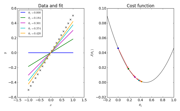
To simplify things, consider fitting a data set to a straight line through the origin: $h_\theta(x) = \theta_1 x$. In this one-dimensional problem, we can plot a simple graph for $J(\theta_1)$ and follow the iterative procedure which trys to converge on its minimum.
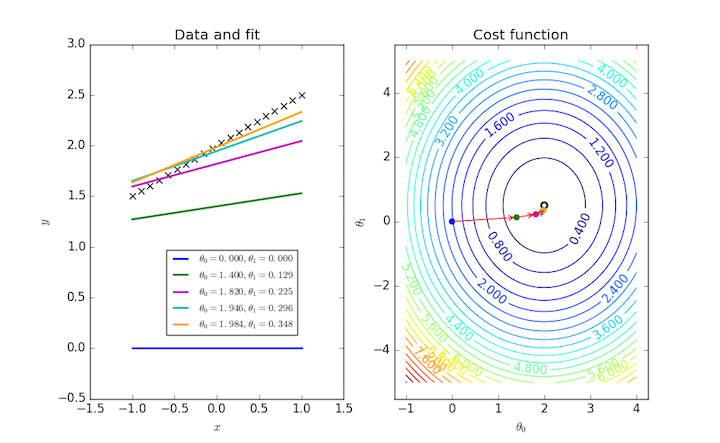
Fitting a general straight line to a data set requires two parameters, and so $J(\theta_0, \theta_1)$ can be visualized as a contour plot. The same iterative procedure over these two parameters can also be followed as points on this plot.
Here's the code for the one-parameter plot:
import numpy as np
import matplotlib.pyplot as plt

# The data to fit
m = 20
theta1_true = 0.5
x = np.linspace(-1,1,m)
y = theta1_true * x

# The plot: LHS is the data, RHS will be the cost function.
fig, ax = plt.subplots(nrows=1, ncols=2, figsize=(10,6.15))
ax[0].scatter(x, y, marker='x', s=40, color='k')

def cost_func(theta1):
    """The cost function, J(theta1) describing the goodness of fit."""
    theta1 = np.atleast_2d(np.asarray(theta1))
    return np.average((y-hypothesis(x, theta1))**2, axis=1)/2

def hypothesis(x, theta1):
    """Our "hypothesis function", a straight line through the origin."""
    return theta1*x

# First construct a grid of theta1 parameter pairs and their corresponding
# cost function values.
theta1_grid = np.linspace(-0.2,1,50)
J_grid = cost_func(theta1_grid[:,np.newaxis])

# The cost function as a function of its single parameter, theta1.
ax[1].plot(theta1_grid, J_grid, 'k')

# Take N steps with learning rate alpha down the steepest gradient,
# starting at theta1 = 0.
N = 5
alpha = 1
theta1 = [0]
J = [cost_func(theta1[0])[0]]
for j in range(N-1):
    last_theta1 = theta1[-1]
    this_theta1 = last_theta1 - alpha / m * np.sum(
                                    (hypothesis(x, last_theta1) - y) * x)
    theta1.append(this_theta1)
    J.append(cost_func(this_theta1))

# Annotate the cost function plot with coloured points indicating the
# parameters chosen and red arrows indicating the steps down the gradient.
# Also plot the fit function on the LHS data plot in a matching colour.
colors = ['b', 'g', 'm', 'c', 'orange']
ax[0].plot(x, hypothesis(x, theta1[0]), color=colors[0], lw=2,
           label=r'$\theta_1 = {:.3f}$'.format(theta1[0]))
for j in range(1,N):
    ax[1].annotate('', xy=(theta1[j], J[j]), xytext=(theta1[j-1], J[j-1]),
                   arrowprops={'arrowstyle': '->', 'color': 'r', 'lw': 1},
                   va='center', ha='center')
    ax[0].plot(x, hypothesis(x, theta1[j]), color=colors[j], lw=2,
               label=r'$\theta_1 = {:.3f}$'.format(theta1[j]))

# Labels, titles and a legend.
ax[1].scatter(theta1, J, c=colors, s=40, lw=0)
ax[1].set_xlim(-0.2,1)
ax[1].set_xlabel(r'$\theta_1$')
ax[1].set_ylabel(r'$J(\theta_1)$')
ax[1].set_title('Cost function')
ax[0].set_xlabel(r'$x$')
ax[0].set_ylabel(r'$y$')
ax[0].set_title('Data and fit')
ax[0].legend(loc='upper left', fontsize='small')

plt.tight_layout()
plt.show()
The following program produces the two-dimensional plot:
import numpy as np
import matplotlib.pyplot as plt

# The data to fit
m = 20
theta0_true = 2
theta1_true = 0.5
x = np.linspace(-1,1,m)
y = theta0_true + theta1_true * x

# The plot: LHS is the data, RHS will be the cost function.
fig, ax = plt.subplots(nrows=1, ncols=2, figsize=(10,6.15))
ax[0].scatter(x, y, marker='x', s=40, color='k')

def cost_func(theta0, theta1):
    """The cost function, J(theta0, theta1) describing the goodness of fit."""
    theta0 = np.atleast_3d(np.asarray(theta0))
    theta1 = np.atleast_3d(np.asarray(theta1))
    return np.average((y-hypothesis(x, theta0, theta1))**2, axis=2)/2

def hypothesis(x, theta0, theta1):
    """Our "hypothesis function", a straight line."""
    return theta0 + theta1*x

# First construct a grid of (theta0, theta1) parameter pairs and their
# corresponding cost function values.
theta0_grid = np.linspace(-1,4,101)
theta1_grid = np.linspace(-5,5,101)
J_grid = cost_func(theta0_grid[np.newaxis,:,np.newaxis],
                   theta1_grid[:,np.newaxis,np.newaxis])

# A labeled contour plot for the RHS cost function
X, Y = np.meshgrid(theta0_grid, theta1_grid)
contours = ax[1].contour(X, Y, J_grid, 30)
ax[1].clabel(contours)
# The target parameter values indicated on the cost function contour plot
ax[1].scatter([theta0_true]*2,[theta1_true]*2,s=[50,10], color=['k','w'])

# Take N steps with learning rate alpha down the steepest gradient,
# starting at (theta0, theta1) = (0, 0).
N = 5
alpha = 0.7
theta = [np.array((0,0))]
J = [cost_func(*theta[0])[0]]
for j in range(N-1):
    last_theta = theta[-1]
    this_theta = np.empty((2,))
    this_theta[0] = last_theta[0] - alpha / m * np.sum(
                                    (hypothesis(x, *last_theta) - y))
    this_theta[1] = last_theta[1] - alpha / m * np.sum(
                                    (hypothesis(x, *last_theta) - y) * x)
    theta.append(this_theta)
    J.append(cost_func(*this_theta))


# Annotate the cost function plot with coloured points indicating the
# parameters chosen and red arrows indicating the steps down the gradient.
# Also plot the fit function on the LHS data plot in a matching colour.
colors = ['b', 'g', 'm', 'c', 'orange']
ax[0].plot(x, hypothesis(x, *theta[0]), color=colors[0], lw=2,
           label=r'$\theta_0 = {:.3f}, \theta_1 = {:.3f}$'.format(*theta[0]))
for j in range(1,N):
    ax[1].annotate('', xy=theta[j], xytext=theta[j-1],
                   arrowprops={'arrowstyle': '->', 'color': 'r', 'lw': 1},
                   va='center', ha='center')
    ax[0].plot(x, hypothesis(x, *theta[j]), color=colors[j], lw=2,
           label=r'$\theta_0 = {:.3f}, \theta_1 = {:.3f}$'.format(*theta[j]))
ax[1].scatter(*zip(*theta), c=colors, s=40, lw=0)

# Labels, titles and a legend.
ax[1].set_xlabel(r'$\theta_0$')
ax[1].set_ylabel(r'$\theta_1$')
ax[1].set_title('Cost function')
ax[0].set_xlabel(r'$x$')
ax[0].set_ylabel(r'$y$')
ax[0].set_title('Data and fit')
axbox = ax[0].get_position()
# Position the legend by hand so that it doesn't cover up any of the lines.
ax[0].legend(loc=(axbox.x0+0.5*axbox.width, axbox.y0+0.1*axbox.height),
             fontsize='small')

plt.show()