Posted by: christian on 26 Apr 2016
The UK government Food Standards Agency (FSA) collects together data on food hygiene from inspections carried out by local authorities in England, Wales and Northern Ireland participating in the national Food Hygiene Rating Scheme (FHRS).
Since all mixtures of luke-warm milk and over-roasted coffee taste the same to me, I thought I'd decide which of the three major coffee chains I should be getting my latte from on the basis of these ratings.
The FHRS awards a score of 0 – 5 to businesses on the basis of how hygienically they handle food and the cleanliness of the premises it is prepared and served in. 5 is the highest rating ("Very Good"), 0 is the lowest ("Urgent Improvement Necessary"). More information is available at the FSA's frequently asked questions page.
Unhelpfully, companies in England and Northern Ireland are not required to show their rating on their premises, but the FSA does provide an online search service on its website.
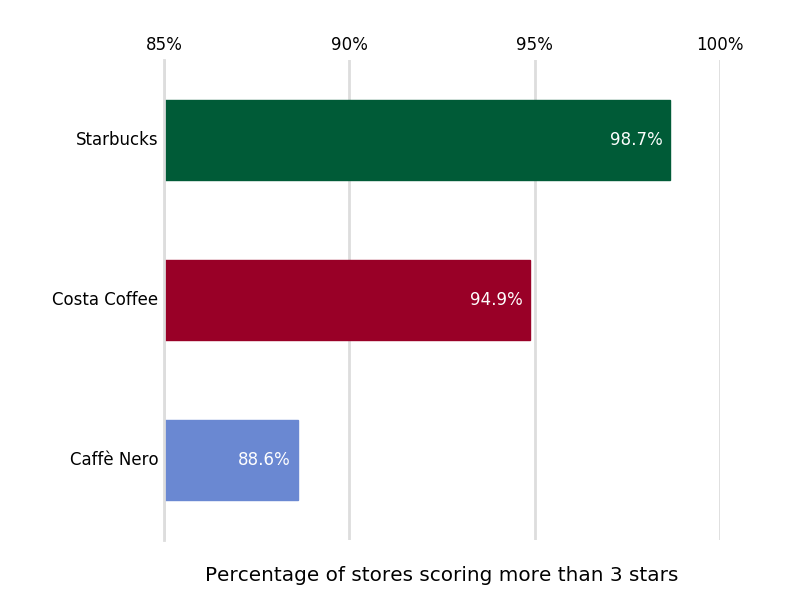
The above figure indicates the percentage of coffee stores scoring more than 3 (i.e. "Good" and above). You are more than twice as likely to walk into a Caffè Nero rated less than "Good" as a Costa, and the proportion of Starbucks rated less than "Good" is almost 10 times smaller than that of Caffè Nero.
The worst coffee shop at the time of the most recent inspection was not, in fact a Caffè Nero: the Costa at 25-27 Market Place, Pocklington, York YO42 2AS got a score of 0 (the only zero-rating in the data set).
The figure below breaks these figures down further.
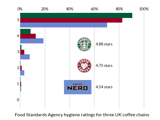
It seems that Starbucks is significantly cleaner than Costa, which in turn rates consistently higher than Caffè Nero.
I simply can't tell the difference in price or quality between any of these chains, so I guess I'll be going to Starbucks for my latte from now on.
Here is the Python code used to generate the figures above.
from collections import namedtuple
import numpy as np
import matplotlib.pyplot as plt
from matplotlib.ticker import StrMethodFormatter
from PIL import Image

# Some useful colours
LIGHT_GREY = '#dddddd'
COSTA_BROWN = (0.6,0,0.153)
CAFFE_NERO_BLUE = (0.416,0.533,0.824)
STARBUCKS_GREEN = (0,0.357,0.216)
# The height of the company logo images, in pixels.
LOGO_HEIGHT = 50

# Food Standards Agency Hygiene ratings (number of stores with
# the number of stars equal to the index of the number (0-5)
star_ratings = {'Costa Coffee': [1,11,22,55,218,1433],
                'Caffè Nero': [0,3,15,35,87,326],
                'Starbucks': [0,1,2,6,56,602]
               }
# Turn the ratings by number of stores into percentages
ratings = {}
for company_name, rating_totals in star_ratings.items():
    ratings[company_name] = (np.array(rating_totals) / sum(rating_totals)*100)

Company = namedtuple('Company',
         'name ratings star_ratings brand_colour logo_filename')

# Initialize the namedtuples representing each company
costa = Company(name='Costa Coffee',
                star_ratings=star_ratings['Costa Coffee'],
                ratings=ratings['Costa Coffee'],
                brand_colour=COSTA_BROWN,
                logo_filename='costa-logo-sm.png')
caffe_nero = Company(name='Caffè Nero',
                star_ratings=star_ratings['Caffè Nero'],
                ratings=ratings['Caffè Nero'],
                brand_colour=CAFFE_NERO_BLUE,
                logo_filename='caffe_nero-logo-sm.jpg')
starbucks = Company(name='Starbucks',
                star_ratings=star_ratings['Starbucks'],
                ratings=ratings['Starbucks'],
                brand_colour=STARBUCKS_GREEN,
                logo_filename='starbucks-logo-sm.png')
companies = (caffe_nero, costa, starbucks)


###############################################################################
# First plot a bar chart of the percentages of stores scoring 0-5 stars.

fig, ax = plt.subplots(facecolor='w')

for i, company in enumerate(companies):
    # Plot the bars for this company
    ax.barh(np.arange(6)+0.3*i-0.3, company.ratings, height=0.3,
             fc=company.brand_colour, ec=company.brand_colour, align='center')
    # In place of a legend, we use an image of the company's logo
    im = Image.open(company.logo_filename)
    width = im.size[0]
    # *right* hand edge and bottom edge locations for image
    x, y = (fig.bbox.xmax // 2, fig.bbox.ymax // 2 + LOGO_HEIGHT * (i*1.5 - 3))
    fig.figimage(im, x - width, y, zorder=10)
    # Add the mean average hygiene rating next to the logo
    average_rating = np.average(np.arange(6), weights=company.star_ratings)
    ax.annotate(s='{:.2f} stars'.format(average_rating),
                xy=(x+15, y+0.5*LOGO_HEIGHT),
                xycoords='figure pixels', va='center')

# Tidy up the plot with some nice styles
ax.set_yticks(range(6))
ax.tick_params(axis='y', length=0)
ax.tick_params(axis='x', length=0)
ax.set_ylim(-0.5, 5.5)
# x-axis grid lines; ticks labelled in percent at the top
ax.xaxis.grid(which='major', c=LIGHT_GREY, lw=2, ls='-')
ax.xaxis.tick_top()
ax.xaxis.set_major_formatter(StrMethodFormatter('{x:.0f}%'))
for spine in ('top', 'bottom'):
    ax.spines[spine].set_visible(False)
for spine in ('left', 'right'):
    ax.spines[spine].set_linewidth(2)
    ax.spines[spine].set_color(LIGHT_GREY)
# Don't let the gridlines go over the plotted bars
ax.set_axisbelow(True)

ax.set_title('Food Standards Agency hygiene ratings for three UK coffee'
             ' chains', y=-0.1)

plt.savefig('coffee_shop_hygiene.png', dpi=70)
plt.show()

###############################################################################
# Now plot a bar chart showing what proportion of stores have
# a food hygiene rating of 3 stars or fewer.

fig, ax = plt.subplots(facecolor='w')
av_less_than_4 = []
for company in companies:
    star_ratings = company.star_ratings
    av_less_than_4.append(np.sum(np.array(star_ratings[:4]) /
                                 sum(star_ratings) * 100))

bars = ax.barh(np.arange(3), av_less_than_4, align='center', height=0.5)
for i, bar in enumerate(bars):
    bar.set_color(companies[i].brand_colour)
    ax.annotate(s='{:.1f}%'.format(av_less_than_4[i]),
                xy=(av_less_than_4[i]-0.2, i), va='center',
                ha='right', color='w')

ax.set_yticks(np.arange(3))
ax.set_xticks([0, 5, 10])
ax.set_yticklabels([company.name for company in companies])
ax.tick_params(axis='y', length=0)
ax.tick_params(axis='x', length=0)
# x-axis grid lines; ticks labelled in percent at the top
ax.xaxis.grid(which='major', c=LIGHT_GREY, lw=2, ls='-')
ax.xaxis.tick_top()
ax.xaxis.set_major_formatter(StrMethodFormatter('{x:.0f}%'))
for spine in ('top', 'bottom', 'right'):
    ax.spines[spine].set_visible(False)
ax.spines['left'].set_linewidth(2)
ax.spines['left'].set_color(LIGHT_GREY)
# Don't let the gridlines go over the plotted bars
ax.set_axisbelow(True)

# Create space to the left of the Axes for the bar labels.
pos = ax.get_position()
pos2 = [pos.x0+0.08, pos.y0, pos.width-0.08, pos.height]
ax.set_position(pos2)

ax.set_title('Percentage of stores scoring 3 stars or less', y=-0.1)

plt.savefig('coffee_shops_less_than_3stars.png')
plt.show()
Each company is represented by a namedtuple acting as a kind of lightweight class. For example:
Shop = namedtuple('Shop', 'name postcode number_of_staff')
creates an object Shop with attributes called name, postcode, etc. An instance of this object has these attributes set on initialization and they can then referred to using the regular "dotted" syntax (the item names must be valid Python identifiers). For example:
>>> tesco = Shop(name='Tesco', postcode='CV32 4DN', number_of_staff=21)
>>> tesco.number_of_staff
21
Comments
Comments are pre-moderated. Please be patient and your comment will appear soon.
There are currently no comments
New Comment