Ridgeline plots of monthly UK temperatures
Posted on 05 February 2022
The UK Meteorological Office offers historical data of mean monthly temperatures in different regions of the UK for download. For the purposes of this blog post, I downloaded the data corresponding to two regions: Scotland.txt and South_England.txt.
There are different ways of analysing these data – the simplest might be just to take the mean and standard deviation. For example, the mean temperature in June in the south of England across the years 1884 – 2021:
import pandas as pd
import matplotlib.pyplot as plt

filename = 'South_England.txt'
df = pd.read_csv(filename, sep='\s+', skiprows=5, header=0,
                 index_col=0).dropna()
print(filename)
print(f"Mean June Temperature = {df['jun'].mean():.1f} °C")
print(f"Standard Deviation = {df['jun'].std():.1f} °C")
which reports:
South_England.txt
Mean June Temperature = 14.3 °C
Standard Deviation = 1.0 °C
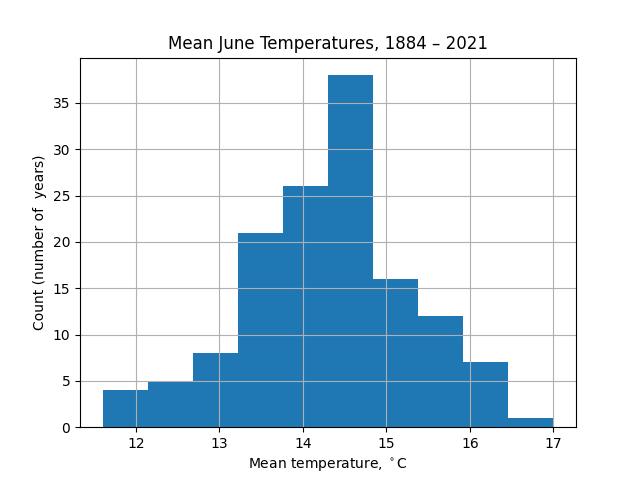
To get more information, the most obvious visualization might be as a histogram: divide the range of temperatures into bins and count how many years fall into each bin.
import matplotlib.pyplot as plt
df['jun'].hist(bins=10)
plt.xlabel(r'Mean monthly temperature, $^\circ\mathrm{C}$')
plt.ylabel('Count (number of  years)')
plt.title('Mean June Temperatures, 1884 – 2021')
plt.show()
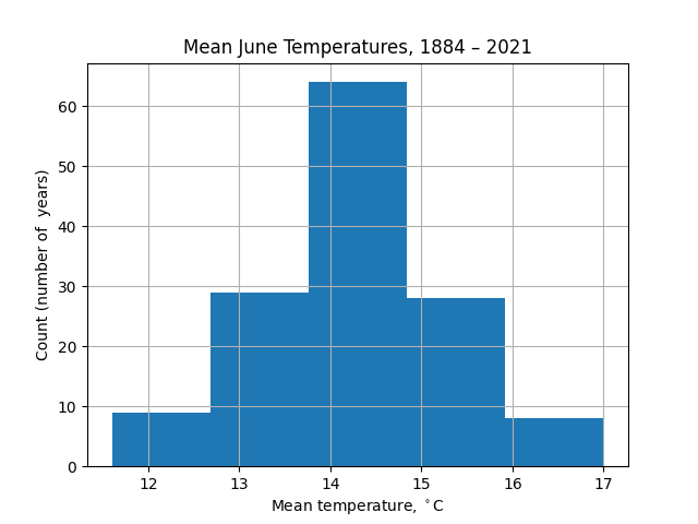
The appearance of this chart is strongly dependent on the number of bins taken. For example, with 5 bins there is less information about the wings of the distribution (extremely hot or cold Junes):
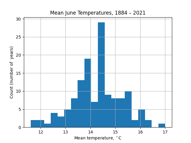
Conversely, with 20 bins the noise in the data distracts from the distribution itself:
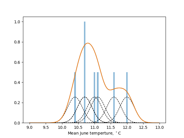
What we are trying to do in plotting these histograms is to visualize the underlying probability distribution of the mean monthly temperatures. An alternative approach is kernel density estimation (KDE), for which the distribution from which $n$ samples, $(x_1, x_2, \ldots, x_n)$ is drawn is estimated as
$$ f_h(x) = \frac{1}{nh}\sum_{i=1}^n K\left(\frac{x-x_i}{h}\right), $$
where $K$ is a kernel function (often taken to be the normal distribution) and $h$ is the bandwidth (broadly, the width of the contribution each sample makes to the estimated total probability distribution function). There is a fun interactive explanation of KDEs here.
KDE produces smooth distributions but are sensitive to the choice of the bandwidth parameter, $h$: too small and unrealistic wiggles appear in the estimated distribution, too large and the distribution is overly smoothed out around the mean, losing its resolution. The implementation scipy.stats.gaussian_kde provided by SciPy's stats module adopts, by default, a bandwidth based on Scott's rule.
As an illustration, the seven samples $(11 , 11.1, 10.4, 10.7, 10.7, 11.6, 12)$ (blue bars) are analysed with a gaussian kernel with bandwidth $h=0.4$ in the figure below. The individual contributions (black dashed bars) sum to give an estimate of the underlying probability density function (orange line).
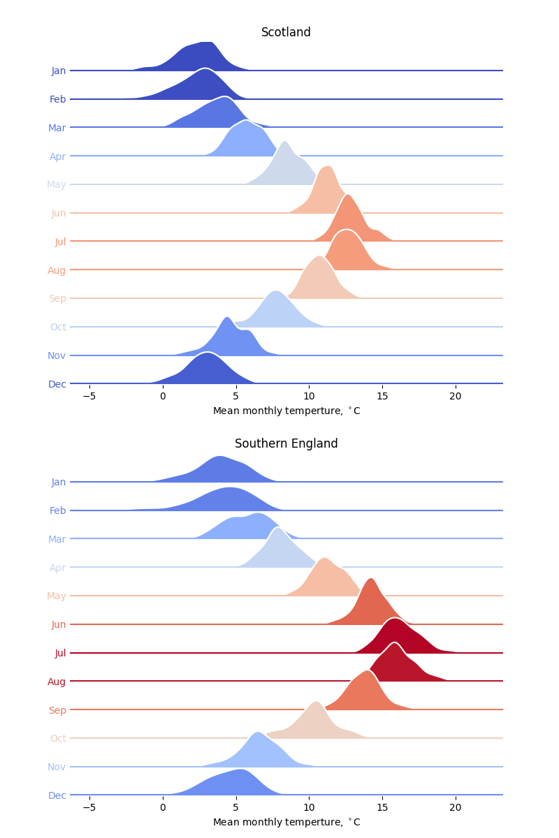
The code below compares the mean monthly temperatures in Scotland and the south of England as ridgeline plots (sometimes called Joy plots after the cover to the Joy Division album, Unknown Pleasures). Instead of histograms, KDEs are used, calculated directly using scipy.stats.gaussian_kde.
The look of this plot is inspired by the similar analysis of historical temperatures in Seattle, WA in the Python Graph Gallery.
import numpy as np
import pandas as pd
import matplotlib.pyplot as plt
from matplotlib.colors import Normalize
from scipy.stats import gaussian_kde
DPI = 100

def plot_monthly_temperatures(filename, ax, title):
    """Make a ridgeline plot from the temperatures on Axes ax."""

    # Read the data into a pandas DataFrame.
    df = pd.read_csv(filename, sep='\s+', skiprows=5, header=0,
                     index_col=0).dropna()
    # The months are identified as the first 12 column names.
    months = df.columns[:12]
    # Get the mean temperatures across all years for each month.
    meanT = df[months].mean()
    # For a single plot, we might just take the min and max for that region.
    #minT, maxT = np.min(meanT), np.max(meanT)
    # But to properly compare across regions, set these to their values across
    # both regions.
    minT, maxT = 2.31, 16.19
    norm = Normalize(vmin=minT, vmax=maxT)

    # The temperature grid to plot the distributions on.
    T = np.arange(-5, 22, 0.1)

    # A colormap: blue (cold) to red (warm).
    cmap = plt.get_cmap('coolwarm')

    # Offset each plot vertically by this amount. It looks nice if they overlap.
    offset = 0.25
    # The y-axis ticks are the month names.
    ax.yaxis.set_tick_params(length=0, width=0)
    ax.set_ylim(-0.01, 12*offset)
    ax.set_yticks(np.arange(0, 12*offset, offset))
    ax.set_yticklabels(months[::-1].str.title())
    yticklabels = ax.yaxis.get_ticklabels()

    for i, month in enumerate(months[::-1]):
        c = cmap(norm(meanT[month]))
        dist = gaussian_kde(df[month])
        # Plot the distribution in an white, which acts as an outline to the
        # filled region (in an appropriate colour) under each line.
        ax.plot(T, dist(T) + i * offset, c='w', zorder=15-i)
        ax.fill_between(T, dist(T) + i * offset, i * offset, fc=c, zorder=15-i)
        # Complete with a base line across the width of the plot.
        ax.axhline(i * offset, c=c, zorder=15-i)
        # Also set the month name to the same colour as the plot.
        yticklabels[i].set_color(c)

    ax.set_xlabel(r'Mean monthly temperture, $^\circ\mathrm{C}$')
    ax.spines['top'].set_visible(False)
    ax.spines['right'].set_visible(False)
    ax.spines['bottom'].set_visible(False)
    ax.spines['left'].set_visible(False)

    ax.set_title(title)

# Two plots, one above the other.
fig, axes = plt.subplots(nrows=2, ncols=1, figsize=(800/DPI, 1200/DPI), dpi=DPI)
filename = 'Scotland.txt'
plot_monthly_temperatures(filename, axes[0], 'Scotland')
filename = 'South_England.txt'
plot_monthly_temperatures(filename, axes[1], 'Southern England')
plt.subplots_adjust(top=0.95, bottom=0.05, hspace=0.2)
plt.savefig('temps-kde.png', dpi=DPI)
plt.show()