Posted by: christian on 1 Aug 2016
The OECD provides a tool for studying the change in average real wages (compared in purchase power parity adjusted US dollars using a 2012 base year). Here is how real wages have changed in 15 countries, visualised on a bar chart visualized with Matplotlib.
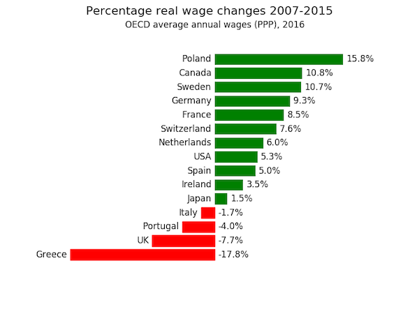
The code used to generate this figure is given below. The data, downloaded directly from the OECD website is in real-wage-changes.csv. The wage changes are broadly in line with those claimed in a recent TUC press release and the chart derived from it circulating on social media with the exception that wages in Greece have apparently fallen much more and those in the UK a bit less than claimed.
Of course, the situation is complicated by the very different employment rates (I would rather my real wage fell than I lose my job) and the fact that the absolute value of real wages differ between these countries (those in Poland are significantly lower than those in the UK).
import pandas as pd
import matplotlib.pyplot as plt

# Study the percentage real wage change between YEAR_START and YEAR_END.
YEAR_START, YEAR_END = 2007, 2015

# Read in the data to a Pandas dataframe.
df = pd.read_csv('real-wage-changes.csv', names=['LOCATION', 'INDICATOR',
        'SUBJECT', 'MEASURE', 'FREQUENCY', 'TIME', 'Value', 'Flag Codes'])

# These are the countries we're interested in, keyed by the 'LOCATION' code
# in the input file.
country_codes = {'CAN': 'Canada',
                 'CHE': 'Switzerland',
                 'DEU': 'Germany',
                 'ESP': 'Spain',
                 'FRA': 'France',
                 'GBR': 'UK',
                 'GRC': 'Greece',
                 'IRL': 'Ireland',
                 'ITA': 'Italy',
                 'JPN': 'Japan',
                 'NLD': 'Netherlands',
                 'POL': 'Poland',
                 'PRT': 'Portugal',
                 'SWE': 'Sweden',
                 'USA': 'USA'
                }

# Get the percent wage change for each country in a dictionary,
# percent_wage_change keyed by country code.
percent_wage_change = {}
for country_code in country_codes.keys():
    wage_start = df[(df['LOCATION']==country_code) &
                    (df['TIME']==YEAR_START)]['Value'].values[0]
    wage_end = df[(df['LOCATION']==country_code) &
                    (df['TIME']==YEAR_END)]['Value'].values[0]
    wage_change = wage_end - wage_start
    percent_wage_change[country_code] = wage_change / wage_start * 100

# Get a list of country codes, sorted in increasing order of % wage change.
sorted_country_codes = sorted(percent_wage_change,key=percent_wage_change.get)

# Now plot a horizontal bar chart
fig, ax = plt.subplots(facecolor='w')
bars = ax.barh(range(len(country_codes)),
               [percent_wage_change[country_code] for country_code
                    in sorted_country_codes],
               fc='g', ec='none', align='center')

# Add labels (country names to the left of the bars, percentage real wage
# changes to the right). Also colour the bars for wage falls in red.
country_name_offset = -0.4
percent_label_offset = +0.4
for i, country_code in enumerate(sorted_country_codes):
    if percent_wage_change[country_code] < 0:
        bars[i].set_color('r')
    ax.annotate(s=country_codes[country_code],
                xy=(min(0, percent_wage_change[country_code]) +
                            country_name_offset, i),
                va='center',
                ha='right')
    ax.annotate(s='{0:.1f}%'.format(percent_wage_change[country_code]),
                xy=(max(0, percent_wage_change[country_code]) +
                            percent_label_offset, i),
                va='center',
                ha='left')

# Tidy up by removing axis spines, tick marks and tick labels.
for spine_pos in ('top', 'right', 'bottom', 'left'):
    ax.spines[spine_pos].set_visible(False)
ax.xaxis.set_ticks_position('none')
ax.yaxis.set_ticks_position('none')
ax.set_axisbelow(True)
ax.set_xticklabels([])
ax.set_yticklabels([])
fig.suptitle('Percentage real wage changes {}-{}'.format(YEAR_START, YEAR_END),
                fontsize=16)
ax.set_title('OECD average annual wages (PPP), 2016', fontsize=12)

plt.show()
Comments
Comments are pre-moderated. Please be patient and your comment will appear soon.
There are currently no comments
New Comment