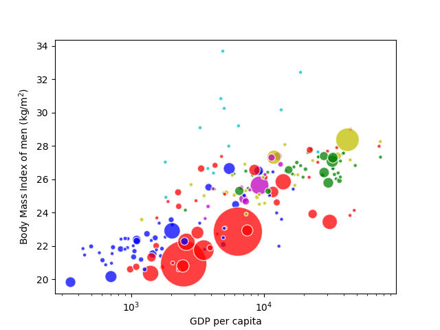
P7.4.3BMI variation with of GDP
A bubble chart is a type of scatter plot which can depict three dimensions of data through the position (\(x\) and \(y\) coordinates) and size of the marker. The plt.scatter method can produce bubble charts by passing the marker size to its s attribute (in \((\mathrm{points})^2\) such that the area of the marker is proportional to the magnitude of the third dimension).
The files gdp.tsv, bmi_men.tsv and population_total.tsv contain the following data from 2007 for each country: the GDP per person per capita in international dollars fixed at 2005 prices, the body mass index (BMI) of men (in \(\mathrm{kg/m^2}\)) and the total population. Generate a bubble chart of BMI against GDP, in which the population is depicted by the size of the bubble markers. Beware: some data is missing for some countries.
Bonus exercise: colour the bubbles by continent using the list provided in the file continents.tsv.
Show solution
Here is one approach:
import numpy as np
import matplotlib.pyplot as plt


def read_data(filename, data_type=float):
    """
    Read in data from filename from two-column, tab-separated format
    of country, value pairs. Cast the value to the data type specified
    by data_type and return it as values to a dictionary keyed by country.

    """

    print(f"Reading data from file {filename}")
    data = {}
    with open(filename, "r") as fi:
        for line in fi.readlines():
            fields = line.split("\t")
            if len(fields) != 2:
                # No data for this country
                continue
            country, value = fields[0], fields[1].strip()
            if not value:
                # Blank data field for this country
                continue
            data[country] = data_type(value)
    return data


# Read in the raw data
raw_pop = read_data("population_total.tsv")
raw_bmi = read_data("bmi_men.tsv")
raw_gdp = read_data("gdp.tsv")
continent = read_data("continents.tsv", str)

# Get an alphabetically-sorted list of countries which have entries in all
# of the data sets just read in.
countries = (
    set(raw_pop.keys())
    & set(raw_bmi.keys())
    & set(raw_gdp.keys())
    & set(continent.keys())
)
countries = sorted(list(countries))

# Convert the dictionaries of data to numpy arrays
pop = np.array([raw_pop[country] for country in countries])
bmi = np.array([raw_bmi[country] for country in countries])
gdp = np.array([raw_gdp[country] for country in countries])

# Set the colours of the plotted bubbles by continent
continent_colours = {
    "Africa": "b",
    "Asia": "r",
    "North America": "y",
    "South America": "m",
    "Europe": "g",
    "Oceania": "c",
}
colours = [continent_colours[continent[country]] for country in countries]

# Set the bubble sizes (circle areas) by population, scaled to 2000 pts^2
# per billion people, but with a minimum size of 16 pts^2
sizes = np.clip(pop / 1.0e9 * 2000, 16, None)

fig, ax = plt.subplots()
sct = ax.scatter(gdp, bmi, s=sizes, c=colours, edgecolor="w")
# Make the bubbles a bit transparent: some large ones overlap smaller ones
sct.set_alpha(0.75)
# The countries' GDPs span several orders of magnitude so a log-scale
# is appropriate.
ax.set_xscale("log")

ax.set_xlabel("GDP per capita")
ax.set_ylabel("Body Mass Index of men (kg/m2)")

plt.show()
The figure produced has been styled to resemble those of gapminder.org.