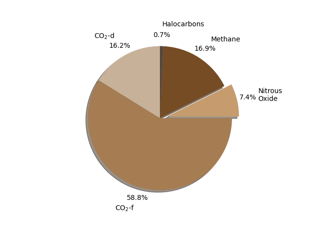
E7.11A pie chart of greenhouse gas emissions
The following program depicts the emissions of greenhouse gases by mass of "carbon equivalent". Data from the 2007 IPCC report, 2007: Climate Change 2007: Synthesis Report. Contribution of Working Groups I, II and III to the Fourth Assessment Report of the Intergovernmental Panel on Climate Change [Core Writing Team, Pachauri, R.K and Reisinger, A. (eds.)].
ggpie
import numpy as np
import matplotlib.pyplot as plt

# Annual greenhouse gas emissions, billion tons carbon equivalent (GtCe).
gas_emissions = np.array(
    [
        (r"$\mathrm{CO_2}$-d", 2.2),
        (r"$\mathrm{CO_2}$-f", 8.0),
        ("Nitrous\nOxide", 1.0),
        ("Methane", 2.3),
        ("Halocarbons", 0.1),
    ],
    dtype=[("source", "U17"), ("emission", "f4")],
)

# 5 colours beige.
colours = ["#C7B299", "#A67C52", "#C69C6E", "#754C24", "#534741"]

explode = [0, 0, 0.1, 0, 0]

fig, ax = plt.subplots()
ax.axis("equal")  # So our pie looks circular!
ax.pie(
    gas_emissions["emission"],
    colors=colours,
    shadow=True,
    startangle=90,
    explode=explode,
    labels=gas_emissions["source"],
    autopct="%.1f%%",
    pctdistance=1.15,
    labeldistance=1.3,
)

plt.show()
The segment corresponding to nitrous oxide has been "exploded" by 10% and the percentage values are formatted to one decimal place (autopct='%.1f%%').