Question P9.5.1
The Organisation for Economic Co-operation and Development (OECD), within its Programme for International Student Assessment (PISA), publishes an evaluation of the educational systems around the world by measuring the performance of 15-year-old school pupils on mathematics, science, and reading. The evaluation is carried out every three years.
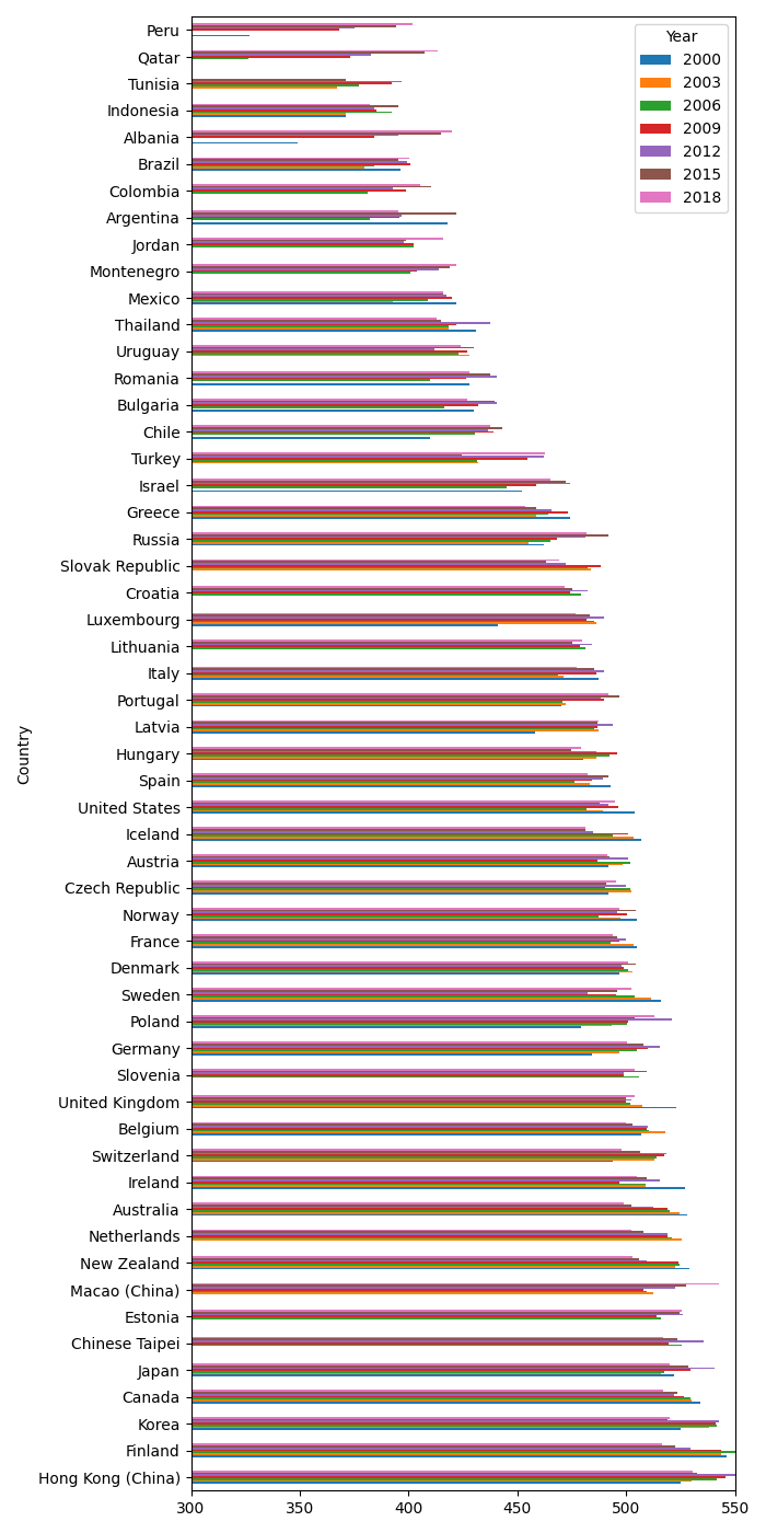
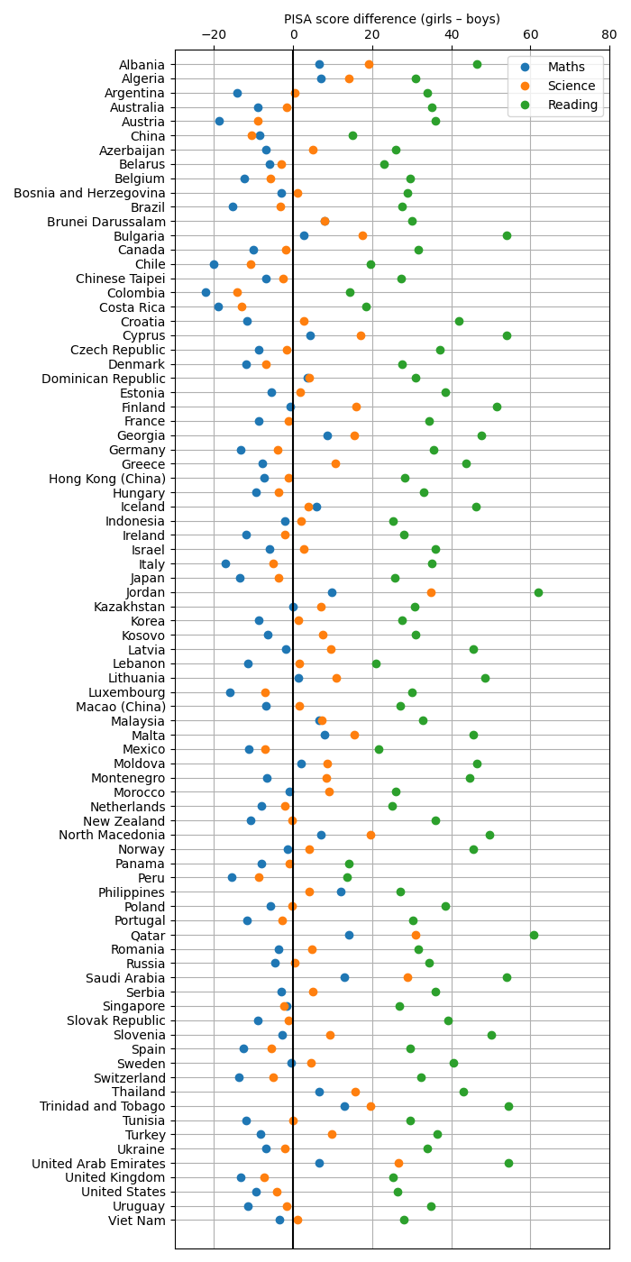
Historical PISA data can be downloaded from PISA-data.tar. Read these data in to a pandas DataFrame and use its grouping functionality to determine and visualize (a) the overall performance of all studied countries over time; (b) the gender disparity (if any) in each of reading, mathematics and science; and (c) the correlation between the performances in each of these areas across all countries.
Solution P9.5.1
The code below creates plots of the PISA scores by country and year, and visualizes the gender gap. There is a strong correlation between scores in the different subjects across the countries:
            Maths   Science   Reading
Maths    1.000000  0.981517  0.958858
Science  0.981517  1.000000  0.979461
Reading  0.958858  0.979461  1.000000
The code:
import numpy as np
import pandas as pd
import matplotlib.pyplot as plt
DPI = 100

subjects = 'Maths', 'Science', 'Reading'

# Load in the data from the three CSV files into dictionaries, keyed by subject.
df_d = {}
for subject in subjects:
    df_d[subject] = pd.read_csv('PISA-{}.csv'.format(subject.lower()),
                                header=[0,1], index_col=0)
    df_d[subject].index.name = 'Country'
# Merge into a single DataFrame and set the column index and names.
df = pd.concat(df_d, axis=1)
idx = df.columns
df.columns = df.columns.set_levels([idx.levels[0],
                                    idx.levels[1].astype(int),
                                    idx.levels[2]])
df.columns.names = ['Subject', 'Year', 'Gender']

# Take only the average scores, average across the subjects and drop rows
# unless they have at least 5 non-NA values.
df_av = df.xs('av', 1, level=2).mean(axis=1, level=1).dropna(thresh=5)
# Reverse the order of the columns so that the earlier dates are first
df_av = df_av[sorted(df_av.columns)]
df_av['mean'] = df_av.mean(axis=1)
df_av.sort_values('mean', inplace=True, ascending=False)

# Construct a DataFrame with the gender gap (girls - boys) for each subject.
df_gap = pd.DataFrame()
for subject in subjects:
    g = df[subject].groupby('Gender', axis=1)
    m = g.mean()
    df_gap[subject] = m['F'] - m['M']

# Construct a DataFrame with the mean PISA scores for each country by subject.
df_subjects = pd.DataFrame()
for subject in subjects:
    df_subjects[subject] = df[subject].mean(axis=1)
# Correlation in PISA scores between the subjects.
print(df_subjects.corr())

# Plot the gender-gap data for each subject by country.
w, h = 700, 1400
fig, ax = plt.subplots(figsize=(w/DPI, h/DPI), dpi=DPI)
ncountries = len(df_gap)
# Use idx as a proxy for the vertical axis, which will be the country.
idx = -np.arange(ncountries, dtype=int)
for subject in subjects:
    ax.plot(df_gap[subject].values, idx, 'o', label=subject)
# Tidy and label the Axes.
ax.set_yticks(idx)
ax.set_yticklabels(df_gap.index)
ax.set_ylim(-ncountries-1, 1)
ax.set_xlim(-30, 80)
ax.set_xlabel('PISA score difference (girls – boys)')
ax.xaxis.set_label_position('top')
ax.xaxis.set_ticks_position('top')
# Mark the 0 of the score gap clearly. Points to the left are scores for which
# boys outperform girls; points to the right are those for which girls
# outperform boys.
ax.axvline(0, c='k')
ax.legend(loc='upper right')
ax.grid()
plt.tight_layout()
plt.savefig('pisa-gender-gap.png', dpi=DPI)
plt.show()

# Plot a bar chart of the PISA scores for each year for each country.
w, h = 700, 1400
fig, ax = plt.subplots(figsize=(w/DPI, h/DPI), dpi=DPI)
# Don't include the 'mean' column in the bar chart.
df_av.iloc(axis=1)[:-1].plot(kind='barh', ax=ax)
ax.set_xlim(300, 550)
plt.tight_layout()
plt.savefig('pisa-by-country.png', dpi=DPI)
plt.show()

