Solution P9.2.2
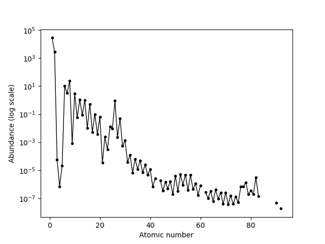
The correct table can be found by matching against the column header "Y1". The biggest difficulty then is parsing this column into floating point type. The pandas funtion str.replace can be used to do this, noting that the minus symbol used (Unicode U+2122) must be replaced with a hyphen.
import pandas as pd
import matplotlib.pyplot as plt

url = 'https://en.wikipedia.org/wiki/Abundances_of_the_elements_(data_page)'
tables = pd.read_html(url, match='Y1')
df = tables[0]
# Match the Index to the elements' atomic numbers
df.index += 1
# Coerce the abundance column to floating point type. Note that the minus
# symbol, U+2122 must be replaced with a hyphen.
df['Y1'] = df['Y1'].str.replace('×10', 'e').str.replace('*','').str.replace('−','-')
df['Y1'] = df['Y1'].astype(float)

fig, ax = plt.subplots()
ax.plot(df.index, df['Y1'], 'o-', c='k', lw=1, ms=3)
ax.set_yscale('log')
ax.set_ylabel('Abundance (log scale)')
ax.set_xlabel('Atomic number')
plt.show()

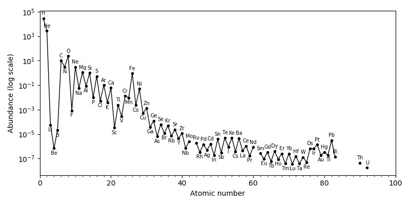
We can label the plotted points with text annotations, but their optimal placement requires a bit of thought:
import numpy as np
import pandas as pd
import matplotlib.pyplot as plt

url = 'https://en.wikipedia.org/wiki/Abundances_of_the_elements_(data_page)'
tables = pd.read_html(url, match='Y1')

df = tables[0]
# Match the Index to the elements' atomic numbers.
df.index += 1
# Coerce the abundance column to floating point type. Note that the minus
# symbol, U+2122 must be replaced with a hyphen.
df['Y1'] = df['Y1'].str.replace('×10', 'e').str.replace('*','').str.replace('−','-')
df['Y1'] = df['Y1'].astype(float)
# Create a new column with the element symbol by parsing the column containing
# the atomic number, element symbol and element name separated by whitespace.
df['Element Symbol'] = df['Element'].str.split(expand=True)[1]

DPI = 100
width, height = 800, 400
fig, ax = plt.subplots(figsize=(width/DPI, height/DPI))
ax.plot(df.index, df['Y1'], 'o-', c='k', lw=1, ms=3)
ax.set_yscale('log')
ax.set_ylabel('Abundance (log scale)')
ax.set_xlim(0, 100)
ax.set_xticks(range(0, 100, 2), minor=True)
ax.set_xlabel('Atomic number')

# Label each plotted point with the element symbol.
# Transform object to translate from data to fractional Axes coordinates.
axis_to_data = ax.transAxes + ax.transData.inverted()
data_to_axis = axis_to_data.inverted()
# Obtain the coordinates of the plotted points in fractional Axes coordinates.
df2 = df[df['Y1'].notna()]
xy = data_to_axis.transform(list(df2['Y1'].iteritems()))

# Displace the label by distance doff and vector offset from the plotted point.
doff = 0.03
offset = np.array((0, doff))
imax = len(xy)
for i in range(imax):
    # Find a good place for the label on the other side of the plotted line.
    if 0 < i < imax-1:
        v1, v2 = xy[i-1] - xy[i], xy[i+1] - xy[i]
        u = v1 + v2
        offset = -doff * u / np.linalg.norm(u)
        # We don't get very satisfactory results if there is a gap in the data
        # so put the labels for elements next to gaps above the plotted point.
        if (df2.iloc[i].name - df2.iloc[i-1].name > 1 or
            df2.iloc[i+1].name - df2.iloc[i].name > 1):
            offset = (0, doff)
    symbol = df2.iloc[i]['Element Symbol']
    x, y = xy[i] + offset
    print(symbol, offset)
    # Add the label
    ax.text(x, y, symbol, ha='center', va='center', transform=ax.transAxes,
            fontsize=7)

plt.tight_layout()
plt.savefig('oddo-harkins-1.png', dpi=DPI)
plt.show()
