Solution P7.4.2
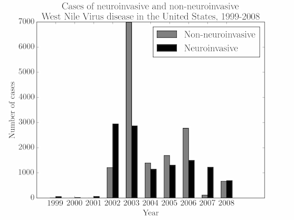
Two bar charts can be plotted on the same axes by repeating the call to ax.bar, but we need to offset the bars in each chart.
We set the xticks explicitly with ax.set_xticks(year) so that every year is labelled (otherwise matplotlib defaults to a sparser tick layout which labels every other year).
import numpy as np
import matplotlib.pyplot as plt

year, cases_inv, cases_noninv = np.loadtxt('wnv.txt', unpack=True, skiprows=4)
fig = plt.figure()
ax = fig.add_subplot(111)

w = 0.3
noninv_bars = ax.bar(year-w, cases_noninv, w, color='gray')
inv_bars = ax.bar(year, cases_inv, w, color='k')

ax.set_ylabel('Number of cases')
ax.set_xlabel('Year')
ax.set_title('Cases of neuroinvasive and non-neuroinvasive\n'
             'West Nile Virus disease in the United States, 1999-2008')
ax.set_xticks(year)
ax.legend((noninv_bars, inv_bars), ('Non-neuroinvasive', 'Neuroinvasive'))

plt.show()
