Question P7.4.1
The Economist's Big Mac Index is a light-hearted measure of purchasing power parity between two currencies. Its premise is that the difference between the price of a McDonald's Big Mac hamburger in one currency (converted into US dollars (USD) at the prevailing exchange rate) and its price in the United States is a measure of the extent to which that currency is over- or under-valued (relative to the dollar).
The following data files provide the historical Big Mac prices and exchange rates for five currencies:
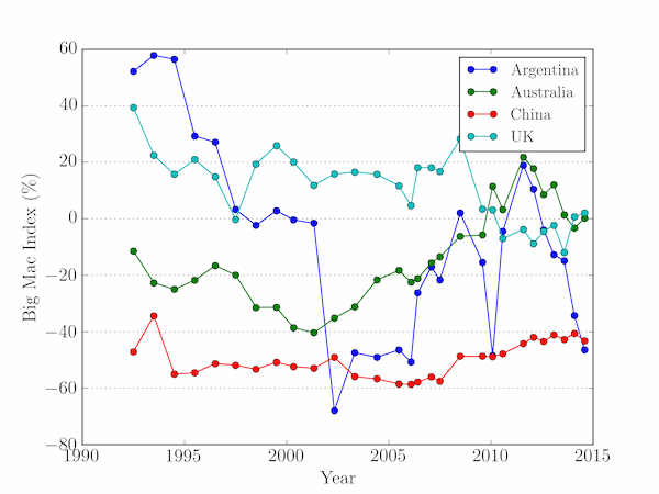
For each of the first four currencies, calculate the percentage over- or under-valuation of each currency as: $$ \frac{(\mathrm{local\;price\;converted\;to\;USD} - \mathrm{US\;price})}{(\mathrm{US\;price})} \times 100 $$ and plot it as a function of time.
Solution P7.4.1
The following code is one approach:
import numpy as np
import matplotlib.pyplot as plt

# US Big Mac prices, bm_us, as a function of time
month, year, bm_us = np.loadtxt('us-bigmac.txt', skiprows=1, unpack=True)

fig = plt.figure()
ax = fig.add_subplot(111)
bmi = {}
countries = ['Argentina', 'Australia', 'China', 'UK']
for country in countries:
    filename = '{}-bigmac.txt'.format(country.lower())
    # Load this country's price and exchange rate data
    _, _, cur_price, ex_rate = np.loadtxt(filename, skiprows=1, unpack=True)
    # Calculate and plot the Big Mac Index as a percentage
    bmi[country] = ((cur_price / ex_rate) - bm_us)/bm_us * 100
    ax.plot(year + month/12, bmi[country], 'o-', label=country)
ax.legend()
ax.yaxis.grid()
ax.set_xlabel('Year')
ax.set_ylabel('Big Mac Index (%)')
plt.show()
