Solution P3.2.3
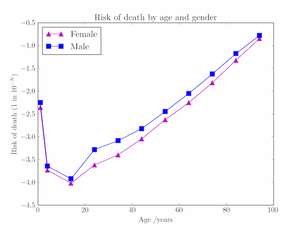
The code below generates a plot of the annual risk of death by age and gender using the provided data.
import numpy as np
import matplotlib.pyplot as plt

# Annual risk of death by age and gender (UK national mortality statistics)
# Risk is 1 in N in age bins given by ages[i-1] - ages[i]
ages = np.array([1, 4, 14, 24, 34, 44, 54, 64, 74, 84, 94])
f_risk = np.array([227, 5376, 10417, 4132, 2488, 1106, 421, 178, 65, 21, 7])
m_risk = np.array([177, 4386, 8333, 1908, 1215, 663, 279, 112, 42, 15, 6])

plt.plot(ages, -np.log10(f_risk), color='m', marker='^',
           markeredgecolor='m', markersize=9, label='Female')
plt.plot(ages, -np.log10(m_risk), color='b', marker='s',
           markeredgecolor='b', markersize=9, label='Male')
plt.xlabel('Age /years')
plt.ylabel('Risk of death (1 in $10^{-N}$)')
plt.legend(loc='upper left')
plt.title('Risk of death by age and gender')
plt.show()
