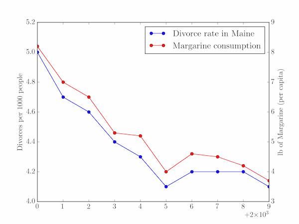
As described on this website of spurious correlations, there is a curious but utterly meaningless correlation over time between the divorce rate in the US state of Maine and the per capita consumption of margarine in that country. The two time series here have different units and meanings and so should be plotted on separate $y$-axes, sharing a common $x$-axis (year).
import pylab

years = range(2000, 2010)
divorce_rate = [5.0, 4.7, 4.6, 4.4, 4.3, 4.1, 4.2, 4.2, 4.2, 4.1]
margarine_consumption = [8.2, 7, 6.5, 5.3, 5.2, 4, 4.6, 4.5, 4.2, 3.7]

line1 = pylab.plot(years, divorce_rate, 'b-o',
                   label='Divorce rate in Maine')
pylab.ylabel('Divorces per 1000 people')
pylab.legend()

pylab.twinx()
line2 = pylab.plot(years, margarine_consumption, 'r-o',
                   label='Margarine consumption')
pylab.ylabel('lb of Margarine (per capita)')

# Jump through some hoops to get the both line's labels in the same legend:
lines = line1 + line2
labels = []
for line in lines:
    labels.append(line.get_label())

pylab.legend(lines, labels)
pylab.show()
We have a bit of extra work to do in order to place a legend labelled with both lines on the plot: pylab.plot returns a list of objects representing the lines that are plotted, so we save them as line1 and line2, concatenate them, and then loop over them to retrieve their labels. The list of lines and labels can then be passed to pylab.legend directly. The result of this code is the graph plotted below.