Update: the frequency of intense tornadoes
Posted on 11 January 2021
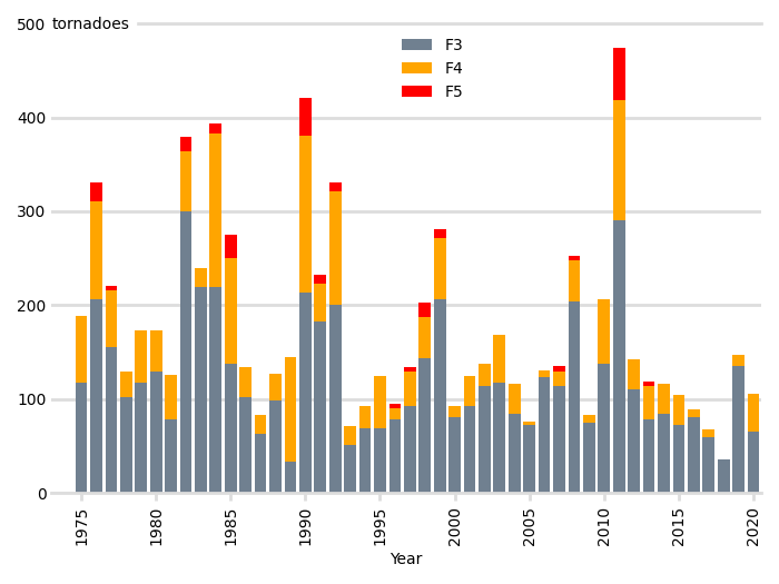
Five years ago, I wrote a blog post, "Is the frequency of intense tornadoes increasing?". Here is an updated plot, including tornadoes up to 2020 and accounting for the National Centers for Environmental Information (NCEI)'s use of the Enhanced Fujita scale – this includes the category "EFU" for tornadoes which inflict no identifiable damage.
It is interesting that there have been no F5 tornadoes since 2013.
The data files need to be obtained in compressed csv format from the NCEI FTP site:
import os
from ftplib import FTP
# connect to the FTP server and login anonymously
ftp = FTP('ftp.ncdc.noaa.gov')
ftp.login()
# navigate to the correct directory and get a list of all filenames
ftp.cwd('/pub/data/swdi/stormevents/csvfiles/')
filenames = ftp.nlst()

# retrieve a sorted list of the details files for events since year_min
details_files = []
year_min = 1975
for filename in filenames:
    if not filename.startswith('StormEvents_details-ftp_v1.0_d'):
        continue
    if int(filename[30:34]) >= year_min:
        details_files.append(filename)
details_files.sort()

for filename in details_files:
    print(filename)
    with open(os.path.join('data', filename), 'wb') as fo:
        ftp.retrbinary("RETR " + filename, fo.write)
The script that produces the plot is given below. Much of the code, which uses pandas is unchanged.
import os
import re
import numpy as np
import pandas as pd
import matplotlib.pyplot as plt
WIDTH, HEIGHT, DPI = 700, 525, 100

def get_f(s):
    try:
        return int(s[-1])
    except IndexError:
        return -1
    except ValueError:
        if s[-1] == 'U':
            print('EFU tornado (unknown damage)')
            return -1
        raise

data = {}
all_files = os.listdir('data')
for filename in all_files:
    m = re.search('_d(\d\d\d\d)', filename)
    year = int(m.groups(0)[0])
    print(year, ':', filename)
    df = pd.read_csv(os.path.join('data', filename),
                     usecols=('TOR_F_SCALE',),
                     converters = {'TOR_F_SCALE': get_f},
                    )
    df = df[df['TOR_F_SCALE'] >= 0]
    tor_f = df.groupby('TOR_F_SCALE')
    data[year] = tor_f['TOR_F_SCALE'].aggregate(np.sum)


years = sorted(list(data.keys()))
# Total number of tornadoes of strength F3 or higher for each year
tornadoes = np.array([[data[year].get(F, 0) for year in years]
                          for F in range(6)])


# A subtle colour for the axes components
LIGHT_GREY = '#dddddd'
fig, ax = plt.subplots(figsize=(WIDTH/DPI, HEIGHT/DPI), dpi=DPI)

# Bar chart with bars in dark grey, aligned centrally
ax.bar(years, tornadoes[3], width=0.8, color='slategray', lw=0, align='center',
       label='F3')
ax.bar(years, tornadoes[4], bottom=tornadoes[3], width=0.8, color='orange',
       lw=0, align='center', label='F4')
ax.bar(years, tornadoes[5], bottom=tornadoes[4]+tornadoes[3], width=0.8,
       color='red', lw=0, align='center', label='F5')

# Set the year tick labels
year_min, year_max = min(years), max(years)
year_ticks = range(year_min, year_max+1, 5)
ax.set_xticks(year_ticks)
ax.set_xticklabels(labels=year_ticks, rotation=90)
# Pad the x-axis a little
ax.set_xlim(year_min - 2, year_max + 0.5)
ax.set_xlabel('Year')
# We don't want ticks at the top of the chart
ax.xaxis.set_ticks_position('bottom')
# Bottom ticks are to face out
ax.tick_params(axis='x', direction='out', length=5, width=2, color=LIGHT_GREY)

# Remove all y-ticks, but add light gray major grid lines every 100 tornadoes
ax.tick_params(axis='y', length=0)
ax.yaxis.grid(which='major', c=LIGHT_GREY, lw=2, ls='-')
ax.set_yticks(range(0, 501, 100))

# Instead of a title, put the y-axis "units" next to the top tick label
ax.text(0, 0.988, 'tornadoes', transform=ax.transAxes,
        backgroundcolor='w')
# Position the legend by hand so that no bars are obscured.
ax.legend(bbox_to_anchor=(0.6, 1), frameon=False)


# Customize the spines: we don't want to remove the whole frame with
# ax.set_frame_on(False) because we want the top and bottom ones styled like
# grid lines, so remove the left and right ones and then do that.
for spine in ('left', 'right'):
    ax.spines[spine].set_visible(False)
for spine in ('top', 'bottom'):
    ax.spines[spine].set_linewidth(2)
    ax.spines[spine].set_color(LIGHT_GREY)
# Don't let the gridlines go over the plotted bars
ax.set_axisbelow(True)
fig.tight_layout()
plt.savefig('tornadoes_1975-2020.png', dpi=DPI)
plt.show()