Is the frequency of intense tornadoes increasing?
Posted on 14 January 2016
Spoiler: I don't know and nor does anyone else.
One of the predictions that some people have made about the effect of global warming is the increase in frequency and intensity of severe weather events such as tornadoes. Unfortunately, the analysis of records of such events is hampered by a lack of reliable data across a long enough time span. A particular concern is the sampling bias introduced as techniques for recording these events have improved over the years: more recent records are likely to have a higher proportion of weaker tornadoes that earlier, less sensitive techniques would have overlooked.
Further problems are introduced by the metric used to assess the strength of a tornado: until 2007, the Fujita scale was widely used. This associates the tornado with a number 0-5 on the basis of the amount of damage it does to human-built structures and vegetation. There is obviously an element of subjectivity in this assessment and its accuracy is limited by the knowledge or assumptions about the strength of construction of the damaged buildings.
For this reason, the wind speeds associated with each point on the Fujita scale are known to be inaccurate. Therefore, in 2007 the Enhanced Fujita scale was introduced in the United States and Canada which aimed to better align the tornado intensity scale with the damage observed.
Disclaimer: The following mini-project is more intended to illustrate the way Python can be used to obtain and analyse data sets than a serious attempt to answer the question in its title.
The United States' National Weather Service's Storm Prediction Center records details about severe weather events in the United States and its database of past events can be visualized on their website. It also makes the database available to download as a series of gzipped CSV files organised by year, both by HTTP and FTP.
To see if there is any trend in the frequency of intense tornadoes, we're going to download this data from the FTP site using Python. The names of the files we're interested in take the form
StormEvents_details-ftp_v1.0_d1950_c20150826.csv.gz
where d1950 is the year that the data apply to and c20150826 is the date that the file was created (this can vary for each of the files).
Using Python's ftplib (part of the standard library) to connect via anonymous FTP, we can obtain the filenames we're interested in (we'll look at all events since 1975) as follows:
from ftplib import FTP
# connect to the FTP server and login anonymously
ftp = FTP('ftp.ncdc.noaa.gov')
ftp.login()
# navigate to the correct directory and get a list of all filenames
ftp.cwd('/pub/data/swdi/stormevents/csvfiles/')
filenames = ftp.nlst()

# retrieve a sorted list of the details files for events since year_min
details_files = []
year_min = 1975
for filename in filenames:
    if not filename.startswith('StormEvents_details-ftp_v1.0_d'):
        continue
    if int(filename[30:34]) >= year_min:
        details_files.append(filename)
details_files.sort()
Actually downloading the data can be done with ftp.retrbinary:
for filename in details_files:
    with open(filename, 'wb') as fo:
        ftp.retrbinary("RETR " + filename, fo.write)
The files we've just downloaded are moderately large with many columns. They have a header line which lists all the fields:
$ head -1 StormEvents_details-ftp_v1.0_d2009_c20151120.csv
BEGIN_YEARMONTH,BEGIN_DAY,BEGIN_TIME,END_YEARMONTH,END_DAY,END_TIME,EPISODE_ID,
EVENT_ID,STATE,STATE_FIPS,YEAR,MONTH_NAME,EVENT_TYPE,CZ_TYPE,CZ_FIPS,CZ_NAME,WFO,
BEGIN_DATE_TIME,CZ_TIMEZONE,END_DATE_TIME,INJURIES_DIRECT,INJURIES_INDIRECT,
DEATHS_DIRECT,DEATHS_INDIRECT,DAMAGE_PROPERTY,DAMAGE_CROPS,SOURCE,MAGNITUDE,
MAGNITUDE_TYPE,FLOOD_CAUSE,CATEGORY,TOR_F_SCALE,TOR_LENGTH,TOR_WIDTH,TOR_OTHER_WFO,
TOR_OTHER_CZ_STATE,TOR_OTHER_CZ_FIPS,TOR_OTHER_CZ_NAME,BEGIN_RANGE,BEGIN_AZIMUTH,
BEGIN_LOCATION,END_RANGE,END_AZIMUTH,END_LOCATION,BEGIN_LAT,BEGIN_LON,END_LAT,
END_LON,EPISODE_NARRATIVE,EVENT_NARRATIVE,DATA_SOURCE
We're only interested in one of these columns, TOR_F_SCALE, which is empty for severe weather events which are not tornadoes, or one of 'Fn' or 'EFn' for a tornado rated as n on either the Fujita or Enhanced Fujita scales respectively.
We can use pandas to read in the data, but we need a converter function, get_f, to turn this field into an integer. We'll extract the last character in the field as n, but turn empty fields into the number -1:
def get_f(s):
    try:
        return int(s[-1])
    except IndexError:
        return -1
(In using this function we make no distinction between values on the Fujita and Enhanced Fujita scales).
We wil create a dictionary of pandas dataframes, one for each year. pandas.read_csv can handle gzipped files without us having to unzip them in the file system. In the below, we remove rows which don't correspond to tornadoes (ie have value -1) with df = df[df['TOR_F_SCALE'] >= 0], and then sum the number of occurences of each distinct F-value using aggregate:
import numpy as np
import pandas as pd
for filename in all_files:
    df = pd.read_csv(filename,
                     usecols=('TOR_F_SCALE',),
                     converters = {'TOR_F_SCALE': get_f},
                     dtype={'TOR_F_SCALE': np.int8})
    df = df[df['TOR_F_SCALE'] >= 0]
    tor_f = df.groupby('TOR_F_SCALE')
    data.append(tor_f['TOR_F_SCALE'].aggregate(np.sum))
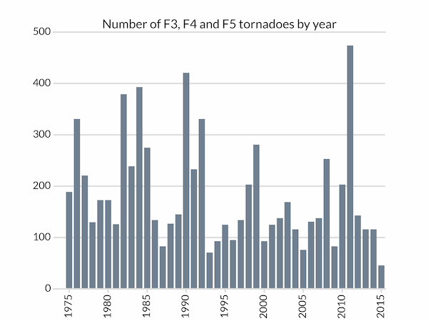
We can now plot a barchart of the number tornadoes of strength F3 (or EF3) or greater. Most of the following code is involved with styling the Matplotlib bar chart:
import matplotlib.pyplot as plt
years = sorted(list(data.keys()))
# Total number of tornadoes of strength F3 or higher for each year
tornadoes = [data[year][3:].sum() for year in years]

# A subtle colour for the axes components
LIGHT_GREY = '#dddddd'
fig, ax = plt.subplots(facecolor='w')

# Bar chart with bars in dark grey, aligned centrally
ax.bar(years, tornadoes, width=0.8, color='slategray', lw=0, align='center')

# Set the year tick labels
year_ticks = range(1975,2016,5)
ax.set_xticks(year_ticks)
ax.set_xticklabels(labels=year_ticks, rotation=90)
# Pad the x-axis a little
ax.set_xlim(years[0]-2, years[-1]+0.5)
ax.set_xlabel('Year')
# We don't want ticks at the top of the chart
ax.xaxis.set_ticks_position('bottom')
# Bottom ticks are to face out
ax.tick_params(axis='x', direction='out', length=5, width=2, color=LIGHT_GREY)

# Remove all y-ticks, but add light gray major grid lines every 100 tornadoes
ax.tick_params(axis='y', length=0)
ax.yaxis.grid(which='major', c=LIGHT_GREY, lw=2, ls='-')
ax.set_yticks([0, 100, 200, 300, 400, 500])

# Customize the spines: we don't want to remove the whole frame with
# ax.set_frame_on(False) because we want the top and bottom ones styled like
# grid lines, so remove the left and right ones and then do that.
for spine in ('left', 'right'):
    ax.spines[spine].set_visible(False)
for spine in ('top', 'bottom'):
    ax.spines[spine].set_linewidth(2)
    ax.spines[spine].set_color(LIGHT_GREY)
# Don't let the gridlines go over the plotted bars
ax.set_axisbelow(True)
ax.set_title('Number of F3, F4 and F5 tornadoes by year')
plt.show()
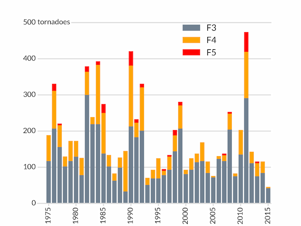
We might wish to break down the intense tornadoes by their strength in a two-dimensional array of intensity (rows) and year (columns):
tornadoes = np.array([[data[year].get(F, 0) for year in years]
                          for F in range(6)])
We need to use get(F, 0) to get the number of tornadoes with strength F because some years do not have any tornadoes of strength F5 and data[year][5] would fail for these years.
With these data, we can now produced a stacked bar chart by, for each year, setting the bottom of each bar equal to the sum of the previous bars' values:
# Bar chart with bars in dark grey, aligned centrally
ax.bar(years, tornadoes[3], width=0.8, color='slategray', lw=0, align='center',
       label='F3')
ax.bar(years, tornadoes[4], bottom=tornadoes[3], width=0.8, color='orange',
       lw=0, align='center', label='F4')
ax.bar(years, tornadoes[5], bottom=tornadoes[4]+tornadoes[3], width=0.8,
       color='red', lw=0, align='center', label='F5')
In addition to the same styling as before, we add a legend and change the title to a text box near the y-axis. The legend for the different coloured bars needs to be positioned manually by specifying the location of its "bbox" in axes coordinates by setting bbox_to_anchor.
# Instead of a title, put the y-axis "units" next to the top tick label
ax.text(0, 0.99, 'tornadoes', transform=ax.transAxes,
        backgroundcolor='w')
# Position the legend by hand so that no bars are obscured.
ax.legend(bbox_to_anchor=(0.8,1.034), frameon=False)