Posted by: christian on 19 Oct 2015
Before Everest was climbed, the "World summit record" was the highest mountain summit climbed by a particular date. It seems likely that people in South America reached several peaks well in excess of 6000 m before records began, so the following table (adapted from Wikipedia's World altitude record article starts only with the first recorded ascent of Aconcagua in 1897.
| Year | Mountain | Height /m |
|---|---|---|
| 1897 | Aconcagua | 6962 |
| 1907 | Trisul | 7120 |
| 1911 | Pauhunri | 7128 |
| 1928 | Kaufman Peak | 7134 |
| 1930 | Nepal Peak | 7177 |
| 1930 | Jongsong Peak | 7462 |
| 1931 | Kamet | 7756 |
| 1936 | Nanda Devi | 7816 |
| 1950 | Annapurna | 8091 |
| 1953 | Everest | 8848 |
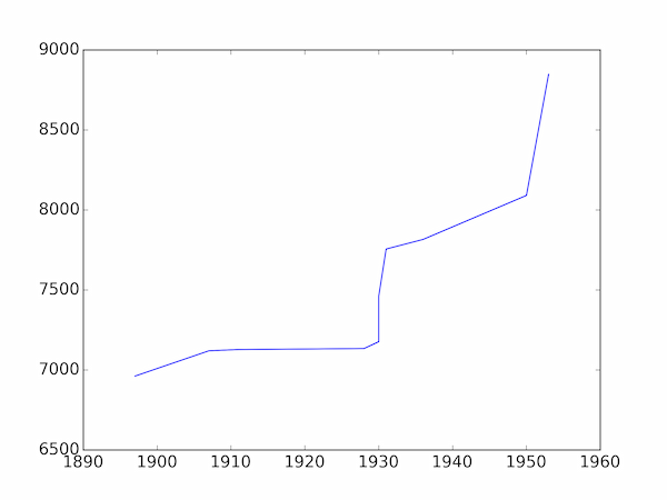
Plotting these data using Matplotlib's default settings gives a rather unappealing figure:
import pylab
# year of first ascent, name and height of highest mountains climbed, in order
summits = [
(1897, 'Aconcagua', 6962.),
(1907, 'Trisul', 7120.),
(1911, 'Pauhunri', 7128.),
(1928, 'Kaufman Peak', 7134.),
(1930, 'Nepal Peak', 7177.),
(1930, 'Jongsong Peak', 7462.),
(1931, 'Kamet', 7756.),
(1936, 'Nanda Devi', 7816.),
(1950, 'Annapurna', 8091.),
(1953, 'Everest', 8848.),
]

# Plot height against year
years = [summit[0] for summit in summits]
heights = [summit[2] for summit in summits]
pylab.plot(years, heights)
pylab.show()

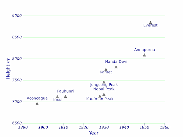
A better-looking graph can be produced by customizing the various elements of the plot as in the following listing:
import matplotlib.pyplot as plt

# year of first ascent, name and height of highest mountains climbed, in order
summits = [
(1897, 'Aconcagua', 6962.),
(1907, 'Trisul', 7120.),
(1911, 'Pauhunri', 7128.),
(1928, 'Kaufman Peak', 7134.),
(1930, 'Nepal Peak', 7177.),
(1930, 'Jongsong Peak', 7462.),
(1931, 'Kamet', 7756.),
(1936, 'Nanda Devi', 7816.),
(1950, 'Annapurna', 8091.),
(1953, 'Everest', 8848.),
]

# Colours for the plot
c1, c2 = '#000088', '#ccffcc'

fig, ax = plt.subplots(facecolor='w')

# Plot height against year
years = [summit[0] for summit in summits]
heights = [summit[2] for summit in summits]
ax.plot(years, heights, ls='', marker='^', alpha=0.5, c='k', ms=9)

# The default axis background colour is white anyway, but for reference:
ax.set_axis_bgcolor('#ffffff')

# Turn on major gridlines for the y-axis and style them
ax.yaxis.grid(True, which='major', color=c2, ls='-', lw=1.5)

# Remove all spines except the bottom one (x-axis) and style it
ax.spines['top'].set_visible(False)
ax.spines['right'].set_visible(False)
ax.spines['bottom'].set_linewidth(1.5)
ax.spines['bottom'].set_color(c2)
ax.spines['left'].set_visible(False)

# Remove tick marks from y-axis and style x-axis tick marks
plt.tick_params(axis='y', length=0)
plt.tick_params(axis='x', top='off', length=7, color=c1, direction='out')

# Pad the top a bit so the highest gridline isn't clipped
ax.set_ylim(6500,9050)

# Label the axes
ax.set_xlabel('Year', color=c1, alpha=0.8)
ax.set_ylabel('Height /m', color=c1, alpha=0.8)

# Style the tick labels
for tick_label in ax.yaxis.get_ticklabels():
    tick_label.set_fontsize(12)
    tick_label.set_fontstyle('italic')
    tick_label.set_color(c1)
for tick_label in ax.xaxis.get_ticklabels():
    tick_label.set_fontsize(12)
    tick_label.set_fontstyle('italic')
    tick_label.set_color(c1)

# Annotate the plot with mountain names, offset suitably so they don't overlap
voffsets = [10,-15,10,-15,10,-15,-15,10,10,-15]
for (x, name, y), voffset in zip(summits, voffsets):
    plt.annotate(name, xy=(x,y), xytext=(0,voffset),
        textcoords = 'offset points', ha = 'center', va = 'bottom',
        fontsize=12, alpha=0.8, color=c1,
        )

plt.show()

Comments
Comments are pre-moderated. Please be patient and your comment will appear soon.
David Soloman 9 years, 4 months ago
I have enjoyed reading your articles.
Link | ReplyYou have syntax error in script - 'c:olor' -> it should be 'color=c1' in line 66
christian 9 years, 4 months ago
Hi David,
Link | ReplyGlad you enjoyed it -- thanks for spotting that (a downside of using vi as an editor...) I've fixed it now!
New Comment