Learning Scientific Programming with Python (2nd edition)
E9.13: Analysing the history of nuclear explosions with pandas
The file nuclear-explosion-data.csv contains data on all nuclear explosions between 1945 and 1998. The data are from N.-O. Bergkvist and R. Ferm, Nuclear Explosions 1945–1998, Swedish Defence Research Establishment/SIPRI, Stockholm, July 2000. We will use pandas to analyze it in various ways.
Inspection of the file in a text editor shows that it contains a header line naming the columns, so we can load it straight away with pd.read_csv and inspect its key features:
In [x]: import pandas as pd
In [x]: df = pd.read_csv('nuclear-explosion-data.csv')
In [x]: df.head()
Out[x]:
       date      time     id country  ... yield_upper purpose       name     type
0  19450716  123000.0  45001     USA  ...        21.0      WR    TRINITY    TOWER
1  19450805  231500.0  45002     USA  ...        15.0  COMBAT  LITTLEBOY  AIRDROP
2  19450809   15800.0  45003     USA  ...        21.0  COMBAT     FATMAN  AIRDROP
3  19460630  220100.0  46001     USA  ...        21.0      WE       ABLE  AIRDROP
4  19460724  213500.0  46002     USA  ...        21.0      WE      BAKER       UW

[5 rows x 16 columns]
In [x]: df.index
Out[x]: RangeIndex(start=0, stop=2051, step=1)

In [x]: df.columns
Out[x]:
Index(['date', 'time', 'id', 'country', 'region', 'source', 'lat', 'long',
       'mb', 'Ms', 'depth', 'yield_lower', 'yield_upper', 'purpose', 'name',
       'type'],
      dtype='object')
There are 16 columns; here we will be concerned with those described in the table below.
| Column | Description |
|---|---|
| date | Date of explosion in format YYYYMMDD |
| time | Time of explosion in format HHMMSS.Z, where Z represents tenths of seconds |
| country | The state that carried out the explosion |
| lat | The latitude of the explosion in degrees, relative to the equator |
| long | The longitude of the explosion in degrees, relative to the prime meridian |
| yield_lower | Lower estimate of the yield in kilotons (kt) of TNT |
| yield_upper | Upper estimate of the yield in kilotons (kt) of TNT |
| type | The method of deployment of the nuclear device |
It is natural to assign the date and time of the explosion to the DataFrame index. Some helper functions facilitate this:
def parse_time(t):
    hour, t = divmod(t, 10000)
    minute, t = divmod(t, 100)
    return int(hour), int(minute), int(t)

def parse_datetime(date, time):
    date_and_time = datetime.strptime(str(date), '%Y%m%d')
    hour, minute, second = parse_time(time)
    return date_and_time.replace(hour=hour, minute=minute, second=second)

df.index = pd.DatetimeIndex([parse_datetime(date, time) for date, time in
                    zip(df['date'], df['time'])])
We can plot the number of explosions in each year by grouping on index.year and finding the size of each group; a regular Matplotlib bar chart can then be produced:
explosion_number = df.groupby(df.index.year).size()

import matplotlib.pyplot as plt
fig, ax = plt.subplots()
ax.bar(explosion_number.index, explosion_number.values)
ax.set_xlabel('Year')
ax.set_ylabel('Number of nuclear explosions')
plt.show()
The resulting plot is shown below.
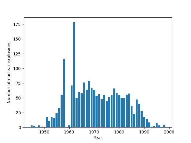
Number of nuclear explosions worldwide per year, 1945–1998.
A stacked bar chart can break down the annual count of explosions by country. First, group by both year and country and get the explosion counts for this grouping with size():
df2 = df.groupby([df.index.year, df.country])
explosions_by_country = df2.size()
print(explosions_by_country.head(7))

      country
1945  USA         3
1946  USA         2
1948  USA         3
1949  USSR        1
1951  USA        16
      USSR        2
1952  UK          1
dtype: int64
Next, unstack the second index into columns, filling the empty entries with zeros:
explosions_by_country = explosions_by_country.unstack().fillna(0)
print(explosions_by_country.head(7))

country  CHINA  FRANCE  INDIA  PAKISTAN   UK   USA  USSR
1945       0.0     0.0    0.0       0.0  0.0   3.0   0.0
1946       0.0     0.0    0.0       0.0  0.0   2.0   0.0
1948       0.0     0.0    0.0       0.0  0.0   3.0   0.0
1949       0.0     0.0    0.0       0.0  0.0   0.0   1.0
1951       0.0     0.0    0.0       0.0  0.0  16.0   2.0
1952       0.0     0.0    0.0       0.0  1.0  10.0   0.0
1953       0.0     0.0    0.0       0.0  2.0  11.0   5.0
Each row in this DataFrame can then be plotted as stacked bars on a Matplotlib chart:
countries = ['USA', 'USSR', 'UK', 'FRANCE', 'CHINA', 'INDIA', 'PAKISTAN']
bottom = np.zeros(len(explosions_by_country))
fig, ax = plt.subplots()
for country in countries:
    ax.bar(explosions_by_country.index, explosions_by_country[country],
            bottom=bottom, label=country)
    bottom += explosions_by_country[country].values

ax.set_xlabel('Year')
ax.set_ylabel('Number of nuclear explosions')
ax.legend()
plt.show()
The stacked bar chart produced is shown here:
Stacked bar chart of the number of nuclear explosions by year caused by different countries between 1945 and 1998.
The geopandas package provides a convenient way to plot the yield data on a world map. A full description of geographic information systems (GIS) is beyond the scope of this book, but geopandas is relatively self-contained and easy to use. First, read in the DataFrame for a low-resolution earth map (included with geopandas), and plot it on a Matplotlib Axes object. We'll accept the default equirectangular projection but customize the borders and fill the land areas in gray:
import geopandas
url = "https://naciscdn.org/naturalearth/110m/cultural/ne_110m_admin_0_countries.zip"
world = geopandas.read_file(url)
fig, ax = plt.subplots()
world.plot(ax=ax, color="0.8", edgecolor='black', linewidth=0.5)
The data provide lower and upper estimates of the explosion yield, so take the average and add circles as a scatter plot at the explosions' latitudes and longitudes. There is quite a large dynamic range from a few kilotons of TNT up to 50 million tons for the Tsar Bomba hydrogen bomb test of 1961, so clip the lower circle size to ensure that the smaller explosions are visible on the map:
df['yield_estimate'] = df[['yield_lower','yield_upper']].mean(axis=1)
sizes = (df['yield_estimate'] / 120).clip(10)
ax.scatter(df['long'], df['lat'], s=sizes, fc='r', ec='none', alpha=0.5)
ax.set_ylim(-60, 90)
plt.axis('off')
plt.show()
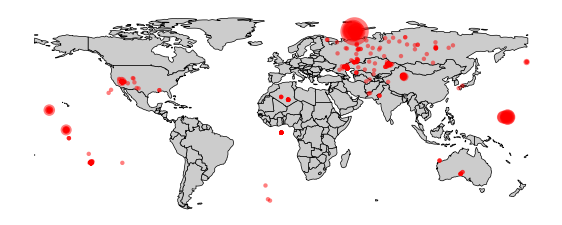
A map of nuclear explosions, showing the blast yield, between 1945 and 1998.