Learning Scientific Programming with Python (2nd edition)
E7.1: A scatter plot of demographic data
To explore the correlation between birth rate, life expectancy and per capita income, we may use a scatter plot. Note that the marker sizes are set in proportion to the countries' per-capita GDP but have to be scaled a little so they don't get too large.
import numpy as np
import matplotlib.pyplot as plt

countries = [
    "Brazil",
    "Madagascar",
    "S. Korea",
    "United States",
    "Ethiopia",
    "Pakistan",
    "China",
    "Belize",
]
# Birth rate per 1000 population
birth_rate = [16.4, 33.5, 9.5, 14.2, 38.6, 30.2, 13.5, 23.0]
# Life expectancy at birth, years
life_expectancy = [73.7, 64.3, 81.3, 78.8, 63.0, 66.4, 75.2, 73.7]
# Per person income fixed to US Dollars in 2000
GDP = np.array([4800, 240, 16700, 37700, 230, 670, 2640, 3490])


def make_plot():
    fig, ax = plt.subplots()
    # Some random colours:
    colours = range(len(countries))
    ax.scatter(birth_rate, life_expectancy, c=colours, s=GDP / 20)
    ax.set_xlim(5, 45)
    ax.set_ylim(60, 85)
    ax.set_xlabel("Birth rate per 1000 population")
    ax.set_ylabel("Life expectancy at birth (years)")
    plt.show()


if "__name__" == "__main__":
    make_plot()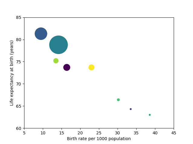
A scatter plot of demographic data for eight countries.
To label the bubbles, add the following code before showing the plot:
offset = 1
for x, y, s, country in zip(birth_rate, life_expectancy, GDP, countries):
    ax.text(x+offset, y, country, va='center')
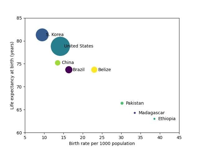
A labelled scatter plot of demographic data for eight countries.