Learning Scientific Programming with Python (2nd edition)
E7.23: A heatmap of Boston temperatures
The following code reads in a data file of maximum daily temperatures in Boston for 2019 and plots them on a heatmap, with a labelled colourbar legend. The data file may be downloaded as boston2019.dat.
import numpy as np
import matplotlib.pyplot as plt

# Read in the relevant data from our input file.
dt = np.dtype([("month", int), ("day", int), ("T", float)])
data = np.genfromtxt(
    "boston2019.dat", dtype=dt, usecols=(1, 2, 3), delimiter=(4, 2, 2, 6)
)

# In our heatmap, nan will mean "no such date", e.g. 31 June.
heatmap = np.empty((12, 31))
heatmap[:] = np.nan

for month, day, T in data:
    # NumPy arrays are zero-indexed; days and months are not!
    heatmap[month - 1, day - 1] = T

# Plot the heatmap, customize and label the ticks.
fig, ax = plt.subplots()
im = ax.imshow(heatmap, interpolation="nearest")
ax.set_yticks(range(12))
ax.set_yticklabels(
    [
        "Jan",
        "Feb",
        "Mar",
        "Apr",
        "May",
        "Jun",
        "Jul",
        "Aug",
        "Sep",
        "Oct",
        "Nov",
        "Dec",
    ]
)
days = np.array(range(0, 31, 2))
ax.set_xticks(days)
ax.set_xticklabels([f"{day + 1:d}" for day in days])
ax.set_xlabel("Day of month")
ax.set_title("Maximum daily temperatures in Boston, 2019")

# Add a colorbar along the bottom and label it.
cbar = fig.colorbar(ax=ax, mappable=im, orientation="horizontal")
cbar.set_label(r"Temperature, $^\circ\mathrm{C}$")

plt.show()
The "mappable" object passed to fig.colorbar is the AxesImage object returned by ax.imshow.
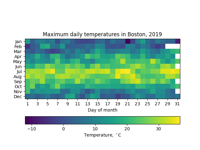
A heatmap of Boston temperatures in 2019.