Visualizing uncertainties in plotted data
Posted on 27 September 2019
The equation for the temperature-dependence of the diffusion of hydrogen in tungsten may be written in Arrhenius form:
$$
k = A\exp\left(-\frac{E}{T}\right) \quad \Rightarrow \; \ln k = \ln A - \frac{E}{T},
$$
where the temperature, $T$, and activation energy, $E$, are expressed in eV and the pre-exponential Arrhenius parameter, $A$, and rate constant, $k$, take units of $\mathrm{m^2\,s^{-1}}$.
From the study of Frauenfelder [1] the parameters $A$ and $E$ may be associated with uncertainties as follows:
$$
\begin{align*}
A & = (4.1 \pm 0.5) \times 10^{-7}\;\mathrm{m^2\,s^{-1}}, \\
E &= 0.39 \pm 0.08 \;\mathrm{eV}.
\end{align*}
$$
These uncertainties can be propagated to the expression for $\ln k$:
$$
\sigma_{\ln k} \approx \sqrt{ \left( \frac{\sigma_A}{A} \right)^2 + \left( \frac{\sigma_E}{T} \right)^2 }.
$$
If we assume the uncertainty remains normally-distributed, Matplotlib's imshow function can be used to illustrate the Arrhenius equation for this data.
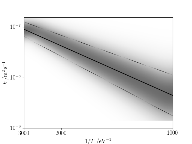
The following code produces the above plot
import numpy as np
from scipy.constants import k as kB, e
import matplotlib.pyplot as plt
from matplotlib import rc
rc('font', **{'family': 'serif', 'serif': ['Computer Modern'], 'size': 14})
rc('text', usetex=True)

# Temperature limits (K), number of temperature points
Tmin, Tmax = 1000, 3000
nT = 10

# Equally-spaced inverse temperature grid, K^-1
invT = np.linspace(1/Tmax, 1/Tmin, nT)
# Convert to eV^-1
invTeV = e * invT / kB

# Activation energy (eV), Arrhenius parameter (m2.s-1) and their
# 1-sigma uncertainties
E, A = 0.39, 4.1e-7
E_unc, A_unc = 0.08, 0.5e-7

def calc_lnk(A, E, invTeV):
    """Calculate the log of the rate coefficient."""
    return np.log(A) - E * invTeV

lnk = calc_lnk(A, E, invTeV)

fig = plt.figure()
ax = fig.add_subplot()

# Arrhenius plot: ln(k) vs. 1/T
plt.plot(invT, lnk, 'k')

# Propagate the errors in A, E to the error in ln(k). NB doesn't really
# preserve normally-distributed errors...
lnk_unc = np.sqrt((A_unc/A)**2 + (E_unc*invTeV)**2)
# Plot the 1-sigma uncertainty intervals
plt.plot(invT, lnk - lnk_unc, 'k:', lw=1)
plt.plot(invT, lnk + lnk_unc, 'k:', lw=1)

minlnk, maxlnk = ax.get_ylim()
ymin, ymax = minlnk, maxlnk
xmin, xmax = invT[0], invT[-1]

# Produce an array of the unnormalized gaussian error distribution about
# a large number of ln(k) points for each of the temperatures
nlnk = 100
_lnk = np.linspace(minlnk, maxlnk, nlnk)
arr = np.exp(-((_lnk[:,np.newaxis] - lnk) / lnk_unc)**2 / 2)

# Plot the error distribution as a grey-scale image: get the orientation right,
# interpolate to make it look smooth, fill the plot area and use a greyscale
# colourmap but max-out at midscale, not full black.
plt.imshow(arr, origin='lower', extent=(xmin,xmax,ymin,ymax),
           interpolation='bicubic', aspect='auto', cmap='Greys',
           vmin=np.min(arr), vmax=np.max(arr)*1.5)

# Set the temperature ticks in Kelvin, not inverse eV, and corresponding label.
Tticks = np.linspace(Tmin, Tmax, 3)
ax.set_xticks(1/Tticks)
ax.set_xticklabels([str(int(tick)) for tick in Tticks])
ax.set_xlabel(r'$1/T \; /\mathrm{eV}^{-1}$')

# Set the ln(k) ticks and label, converting logarithm base from e to 10.
yticks = ax.get_yticks() / np.log(10)
ytick_min = int(np.round(np.min(yticks)))
ytick_max = int(np.round(np.max(yticks)))
nyticks = ytick_max - ytick_min + 1
yticks = np.linspace(ytick_min, ytick_max, nyticks)
ax.set_yticks(yticks * np.log(10))
ax.set_yticklabels([r'$10^{{ {} }}$'.format(int(ytick)) for ytick in yticks])
ax.set_ylabel(r'$k \; /\mathrm{{ m^2\,s^{-1} }}$')

plt.savefig('plot-rate-unc.png')
plt.show()
- R. Frauenfelder, Solution and diffusion of Hydrogen in Tungsten, Journal of Vacuum Science and Technology 6, 388 (1969)