Visualizing the Temperature in Cambridge, UK
Posted on 31 July 2022
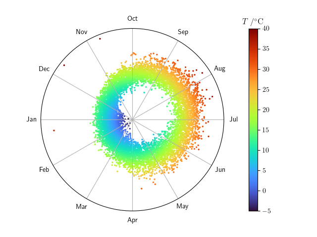
The Digital Technology Group (DTG) at Cambridge University has been recording the weather from the roof of their building since 1995. The complete data are available to download in CSV format from the DTG website as the file weather-raw.csv.
The script below visualizes these data as a polar scatter plot with the day of the year indicated by the angle:
The year can be extended as the vertical axis of a 3D plot, as in the following example:

import numpy as np
import pandas as pd
import matplotlib.pyplot as plt
from matplotlib import cm
from matplotlib.colors import Normalize
from mpl_toolkits.mplot3d import Axes3D
plt.rcParams['text.usetex'] = True

# Read the data into a DataFrame, using the timestamp as the index and selecting
# the temperature column.
df = pd.read_csv('weather-raw.csv', names=['timestamp', 'T'], usecols=(0,1),
                 index_col=[0])
df.index = pd.to_datetime(df.index)

# The temperature in the data file is encoded as 10 * T, so retrieve the real
# temperature, in degC.
df['T'] /= 10

# Select the maximum temperature on each day of the year.
df2 = df.groupby(pd.Grouper(level='timestamp', freq='D')).max()

# Convert the timestamp to the number of seconds since the start of the year.
df2['secs'] = (df2.index - pd.to_datetime(df2.index.year, format='%Y')).total_seconds()
# Approximate the angle as the number of seconds for the timestamp divide by
# the number of seconds in an average year.
df2['angle'] = df2['secs'] / (365.25 * 24 * 60 * 60) * 2 * np.pi

# For the colourmap, the minimum is the largest multiple of 5 not greater than
# the smallest value of T; the maximum is the smallest multiple of 5 not less
# than the largest value of T, e.g. (-3.2, 40.2) -> (-5, 45).
Tmin = 5 * np.floor(df2['T'].min() / 5)
Tmax = 5 * np.ceil(df2['T'].max() / 5)

# Normalization of the colourmap.
norm = Normalize(vmin=Tmin, vmax=Tmax)
c = norm(df2['T'])

def plot_polar():
    fig = plt.figure()
    ax = fig.add_subplot(projection='polar')
    # We prefer 1 January (0 deg) on the left, but the default is to the
    # right, so offset by 180 deg.
    ax.set_theta_offset(np.pi)
    cmap = cm.turbo
    ax.scatter(df2['angle'], df2['T'], c=cmap(c), s=2)

    # Tick labels.
    ax.set_xticks(np.arange(0, 2 * np.pi, np.pi / 6))
    ax.set_xticklabels(['Jan', 'Feb', 'Mar', 'Apr', 'May', 'Jun',
                        'Jul', 'Aug', 'Sep', 'Oct', 'Nov', 'Dec'])
    ax.set_yticks([])

    # Add and title the colourbar.
    cbar = fig.colorbar(cm.ScalarMappable(norm=norm, cmap=cmap),
                        ax=ax, orientation='vertical', pad=0.1)
    cbar.ax.set_title(r'$T\;/^\circ\mathrm{C}$')

    plt.show()

def plot_3d():
    fig = plt.figure()
    ax = fig.add_subplot(projection='3d')
    cmap = cm.turbo
    X = df2['T'] * np.cos(df2['angle'] + np.pi)
    Y = df2['T'] * np.sin(df2['angle'] + np.pi)
    z = df2.index.year
    ax.scatter(X, Y, z, c=cmap(c), s=2)

    ax.set_xticks([])
    ax.set_yticks([])
    cbar = fig.colorbar(cm.ScalarMappable(norm=norm, cmap=cmap),
                        ax=ax, orientation='horizontal', pad=-0.02, shrink=0.6)
    cbar.ax.set_title(r'$T\;/^\circ\mathrm{C}$')
    plt.show()

plot_polar()
plot_3d()