Plotting nuclide halflives
Posted on 29 September 2020
More than 3000 nuclides (atomic species characterised by the number of neutrons and protons in their nuclei) are known, most of them radioactive with a half-life of less than an hour. About 250 or so of them are stable (not observed to decay using presently-available instruments). The IAEA has an interactive online browser of the nuclides.
The script below indicates the half-lives of the nuclides listed on the Japan Atomic Energy Agency's Nuclear Data web page. The so-called valley of stability is the diagonal region along the centre of the field of plotted data. Note that the greater the number of protons in a nucleus, the more neutrons are required to stabilize it.
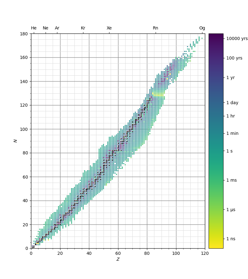
Stable nuclides are indicated in black and radioactive nuclides plotted in markers coloured on a logarithmic scale according to their half-lives. The input data file is halflives.txt.
A certain amount of work is involved in keeping the scatter plot markers at an appropriate size as the interactive Matplotlib window is resized. The function get_marker_size achieves this by obtaining the Axes dimensions, deducing the spacing between the grid points in points (1/72") and setting the size attribute (indicating the marker area in points squared) to keep the markers at a more-or-less constant proportion of the plot area.
import numpy as np
import matplotlib.pyplot as plt
from matplotlib.colors import Normalize
from matplotlib.cm import ScalarMappable
from matplotlib import ticker
PTS_PER_INCH = 72

element_symbols = [
 'H', 'He', 'Li', 'Be',  'B',  'C',  'N',  'O',  'F', 'Ne', 'Na', 'Mg', 'Al',
'Si',  'P',  'S', 'Cl', 'Ar',  'K', 'Ca', 'Sc', 'Ti',  'V', 'Cr', 'Mn', 'Fe',
'Co', 'Ni', 'Cu', 'Zn', 'Ga', 'Ge', 'As', 'Se', 'Br', 'Kr', 'Rb', 'Sr',  'Y',
'Zr', 'Nb', 'Mo', 'Tc', 'Ru', 'Rh', 'Pd', 'Ag', 'Cd', 'In', 'Sn', 'Sb', 'Te',
 'I', 'Xe', 'Cs', 'Ba', 'La', 'Ce', 'Pr', 'Nd', 'Pm', 'Sm', 'Eu', 'Gd', 'Tb',
'Dy', 'Ho', 'Er', 'Tm', 'Yb', 'Lu', 'Hf', 'Ta',  'W', 'Re', 'Os', 'Ir', 'Pt',
'Au', 'Hg', 'Tl', 'Pb', 'Bi', 'Po', 'At', 'Rn', 'Fr', 'Ra', 'Ac', 'Th', 'Pa',
 'U', 'Np', 'Pu', 'Am', 'Cm', 'Bk', 'Cf', 'Es', 'Fm', 'Md', 'No', 'Lr', 'Rf',
'Db', 'Sg', 'Bh', 'Hs', 'Mt', 'Ds', 'Rg', 'Cn', 'Nh', 'Fl', 'Mc', 'Lv', 'Ts',
'Og'
]

def get_marker_size(ax, nx, ny):
    """Determine the appropriate marker size (in points-squared) for ax."""

    # Get Axes width and height in pixels.
    bbox = ax.get_window_extent().transformed(fig.dpi_scale_trans.inverted())
    width, height = bbox.width, bbox.height
    # Spacing between scatter point centres along the narrowest dimension.
    spacing = min(width, height) * PTS_PER_INCH / min(nx, ny)
    # Desired radius of scatter points.
    rref =  spacing / 2 * 0.5
    # Initial scatter point size (area) in pt^2.
    s = np.pi * rref**2
    return s

# Read in the data, determining the nuclide half-lives as a function of the
# number of neutrons, N, and protons, Z. Stable nuclides are indicated with
# -1 in the half-life field: deal with these separately from the radioactive
# nuclei.
halflives = {}
stables = []
for line in open('halflives.txt'):
    line = line.rstrip()
    halflife = line[10:]
    if halflife == 'None':
        continue
    fields = line[:10].split('-')
    symbol = fields[0]
    A = int(fields[1].split()[0])
    Z = int(element_symbols.index(symbol)) + 1
    N = A - Z
    halflife = float(halflife)
    if halflife < 0:
        stables.append((N, Z))
    else:
        halflives[(N, Z)] = halflife

# Unwrap the halflives dictionary into sequences of N, Z, thalf; take the log.
k, thalf = zip(*halflives.items())
N, Z = zip(*k)
maxN, maxZ = 180, 120
log_thalf = np.log10(thalf)

# Initial dimensions of the plot (pixels); figure resolution (dots-per-inch).
w, h = 800, 900
DPI = 100
w_in, h_in = w / DPI, h / DPI
# Set up the figure: one Axes object for the plot, another for the colourbar.
fig, (ax, cax) = plt.subplots(1, 2,
                        gridspec_kw={'width_ratios': [12, 1], 'wspace': 0.04},
                        figsize=(w_in, h_in), dpi=DPI)

# Pick a colourmap and set the normalization: nuclides with half-lives of less
# than 10^vmin or greater than 10^vmax secs are off-scale.
cmap = plt.get_cmap('viridis_r')
norm = Normalize(vmin=-10, vmax=12)
colours = cmap(norm(log_thalf))
s = get_marker_size(ax, maxZ, maxN)
sc1 = ax.scatter(Z, N, c=colours, s=s)
# Stable nuclides are plotted in black ('k').
Nstable, Zstable = zip(*stables)
sc2 = ax.scatter(Zstable, Nstable, c='k', s=s, label='stable')

# Jump through the usual hoops to get a grid on both major and minor ticks
# under the data.
loc = ticker.MultipleLocator(base=5)
ax.xaxis.set_minor_locator(loc)
ax.yaxis.set_minor_locator(loc)
ax.grid(which='minor', color='#dddddd')
ax.grid(which='major', color='#888888', lw=1)
ax.set_axisbelow(True)

ax.set_xlim(0, maxZ)
ax.set_ylim(0, maxN)
ax.set_xlabel(r'$Z$')
ax.set_ylabel(r'$N$')

# Twin the y-axis to indicate the noble gas elements on the top x-axis.
topax = ax.twiny()
topax.set_xticks([2, 10, 18, 36, 54, 86, 118])
topax.set_xticklabels(['He', 'Ne', 'Ar', 'Kr', 'Xe', 'Rn', 'Og'])
topax.set_xlim(0, maxZ)

# The colourbar: label key times in appropriate units.
cbar = fig.colorbar(ScalarMappable(norm=norm, cmap=cmap), cax=cax)
SECS_PER_DAY = 24 * 3600
SECS_PER_YEAR = 365.2425 * SECS_PER_DAY
cbar_ticks = np.log10([1.e-9, 1.e-6, 1.e-3, 1, 60, 3600, SECS_PER_DAY,
                   SECS_PER_YEAR, 100 * SECS_PER_YEAR, 10000 * SECS_PER_YEAR])
cbar_ticklabels = ['1 ns', '1 μs', '1 ms', '1 s', '1 min', '1 hr', '1 day',
                   '1 yr', '100 yrs', '10000 yrs']
cbar.set_ticks(cbar_ticks)
cbar.set_ticklabels(cbar_ticklabels)

def on_resize(event):
    """Callback function on interactive plot window resize."""
    # Resize the scatter plot markers to keep the plot looking good.
    s = get_marker_size(ax, maxZ, maxN)
    sc1.set_sizes([s]*len(Z))
    sc2.set_sizes([s]*len(stables))

# Attach the callback function to the window resize event.
cid = fig.canvas.mpl_connect('resize_event', on_resize)

plt.savefig('nuclide-halflifes.png', dpi=DPI)
plt.show()