Plotting COVID-19 cases
Posted on 27 March 2020
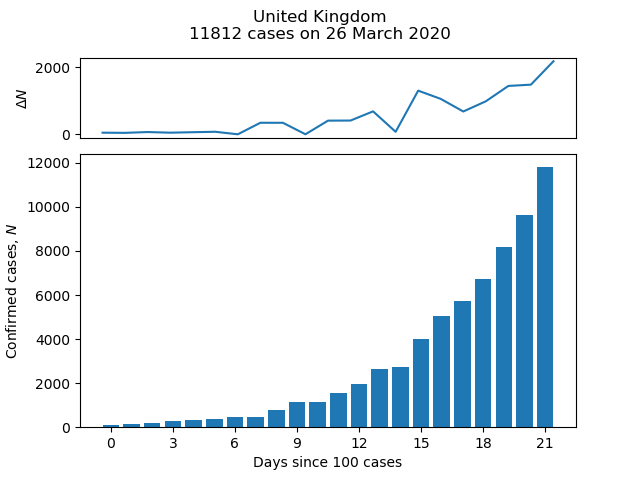
The Centre for Systems Science and Engineering (CSSE) at Johns Hopkins University publishes daily statistics of the number of confirmed cases of COVID-19 by country on its GitHub page. The short script below pulls data from this page to plot a bar chart of cases and growth in cases as a function of time for a given country. For example:
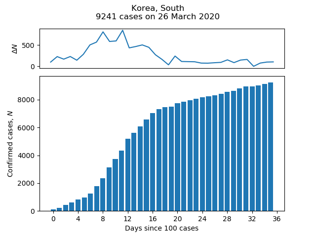
Change the value of the variable country to plot for a different country, using one of the values in the "Country/Region" column of the CSV file in time_series_covid19_confirmed_global.csv.
import sys
import pandas as pd
import matplotlib.pyplot as plt
from matplotlib.ticker import MaxNLocator

# If you have saved a local copy of the CSV file as LOCAL_CSV_FILE,
# set READ_FROM_URL to True
READ_FROM_URL = True
LOCAL_CSV_FILE = 'covid-19-cases.csv'

# Start the plot on the day when the number of confirmed cases reaches MIN_CASES.
MIN_CASES = 100

# The country to plot the data for.
country = 'United Kingdom'

# This is the GitHub URL for the Johns Hopkins data in CSV format
data_loc = ('https://raw.githubusercontent.com/CSSEGISandData/COVID-19/master/'
           'csse_covid_19_data/csse_covid_19_time_series'
           '/time_series_covid19_confirmed_global.csv')

# Read in the data to a pandas DataFrame.
if not READ_FROM_URL:
    data_loc = LOCAL_CSV_FILE
df = pd.read_csv(data_loc)

# Group by country and sum over the different states/regions of each country.
grouped = df.groupby('Country/Region')
df2 = grouped.sum()

def make_plot(country):
    """Make the bar plot of case numbers and change in numbers line plot."""

    # Extract the Series corresponding to the case numbers for country.
    c_df = df2.loc[country, df2.columns[3:]]
    # Discard any columns with fewer than MIN_CASES.
    c_df = c_df[c_df >= MIN_CASES].astype(int)
    # Convet index to a proper datetime object
    c_df.index = pd.to_datetime(c_df.index)
    n = len(c_df)
    if n == 0:
        print('Too few data to plot: minimum number of cases is {}'
                .format(MIN_CASES))
        sys.exit(1)

    fig = plt.Figure()

    # Arrange the subplots on a grid: the top plot (case number change) is
    # one quarter the height of the bar chart (total confirmed case numbers).
    ax2 = plt.subplot2grid((4,1), (0,0))
    ax1 = plt.subplot2grid((4,1), (1,0), rowspan=3)
    ax1.bar(range(n), c_df.values)
    # Force the x-axis to be in integers (whole number of days) in case
    # Matplotlib chooses some non-integral number of days to label).
    ax1.xaxis.set_major_locator(MaxNLocator(integer=True))

    c_df_change = c_df.diff()
    ax2.plot(range(n), c_df_change.values)
    ax2.set_xticks([])

    ax1.set_xlabel('Days since {} cases'.format(MIN_CASES))
    ax1.set_ylabel('Confirmed cases, $N$')
    ax2.set_ylabel('$\Delta N$')

    # Add a title reporting the latest number of cases available.
    title = '{}\n{} cases on {}'.format(country, c_df[-1],
                c_df.index[-1].strftime('%d %B %Y'))
    plt.suptitle(title)

make_plot(country)
plt.show()