Plotting COVID-19 case growth charts
Posted on 29 March 2020
Following on from this previous post, here is a short tutorial on creating this and similar charts using pandas by automatically downloading data from Johns Hopkins University's CSSE GitHub repository (the "JHU/CSSE dataset").
The code described here is available on my GitHub repository
First, we'll want a local copy of the data (up to the current date) so we don't have to keep downloading it from the internet. pandas makes this easy, since the CSV data is already well-formatted, with a header line:
import pandas as pd

# The confirmed cases by country
data_url = ('https://raw.githubusercontent.com/CSSEGISandData/COVID-19/master/'
            'csse_covid_19_data/csse_covid_19_time_series'
            '/time_series_covid19_confirmed_global.csv')

df = pd.read_csv(data_url)
df.to_csv('covid-19-cases.csv')

# The number of deaths by country
data_url = ('https://raw.githubusercontent.com/CSSEGISandData/COVID-19/master/'
            'csse_covid_19_data/csse_covid_19_time_series'
            '/time_series_covid19_deaths_global.csv')

df = pd.read_csv(data_url)
df.to_csv('covid-19-deaths.csv')
We also want a list of country populations: Wikipedia has a suitable page, but not all the country names used on this page are the same as those used in the JHU/CSSE data set, so we have some cleaning to do. First create a dictionary of mapping those from the dataset to those on the Wikipedia page, and save it in a file called country_aliases.py:
# country_aliases.py
"""
A mapping from country names in the JHU/CSSE dataset to those used by the
Wikipedia page for country populations.
"""

country_aliases = {
    'Cabo Verde': 'Cape Verde',
    'Congo (Brazzaville)': 'Congo',
    'Congo (Kinshasa)': 'DR Congo',
    "Cote d'Ivoire": 'Ivory Coast',
    'Czechia': 'Czech Republic',
    'Holy See': 'Vatican City',
    'Korea, South': 'South Korea',
    'Taiwan*': 'Taiwan',
    'US': 'United States',
    'Timor-Leste': 'East Timor',
    'West Bank and Gaza': 'Palestine',
}
Next, create a CSV file with the populations for each country in the JHU/CSSE, read in from Wikipedia. We skip non-country entries such as the Diamond Princess cruise ship.
# get_country_populations.py
"""
Get a CSV file of country populations using the same naming conventions as the
Johns Hopkins / CSSE COVID-19 dataset.
"""

import pandas as pd
from country_aliases import country_aliases

# This is the URL to the Wikipedia page for country populations we will use:
url = 'https://en.wikipedia.org/wiki/List_of_countries_and_dependencies_by_population'
# The table we're interested in is the first one read in from the webpage.
df = pd.read_html(url)[0]

# Rename the relevant column to something more manageable.
df.rename(columns={'Country (or dependent territory)': 'Country'}, inplace=True)
# Get rid of the footnote indicators, "[a]", "[b]", etc.
df['Country'] = df['Country'].str.replace('\[\w\]', '')
# Set the 'Country' column to be the index.
df.index = df['Country']

# Our local copy of the COVID-19 cases file.
LOCAL_CSV_FILE = 'covid-19-cases.csv'
df2 = pd.read_csv(LOCAL_CSV_FILE)
# Get the unique country names.
jh_countries = df2['Country/Region'].unique()

with open('country_populations.csv', 'w') as fo:
    print('Country, Population', file=fo)
    for country in jh_countries:
        # If a country named in the CSSE dataset isn't in our populations table
        # then look it up in the aliases dictionary ...
        if country not in df.index:
            try:
                country = country_aliases[country]
            except KeyError:
                # ... if we can't find it in the aliases, skip it.
                print('Skipping', country)
                continue
        # Write the country and its population to the CSV file.
        print('"{}", {}'.format(country, df.at[country, 'Population']),
              file=fo)
Now, to make the plots, the file plot_cases.py is broken down below (see my GitHub repository for this article for the complete source code file). First, some imports, including the country_aliases dictionary we defined earlier:
import sys
import pandas as pd
import numpy as np
import matplotlib.pyplot as plt
from matplotlib.ticker import MaxNLocator

from country_aliases import country_aliases
The MaxNLocator import is used later to ensure that our tick labels are integers.
To be as flexible as possible, there are some flags determining how the code works:
-
READ_FROM_URL: whether or not to read the latest data from the JHU/CSSE GitHub repo. IfFalse, a local CSV file is used. -
MIN_CASES: the minimum number of cases to start the plot at (the x-axis of the plot is the number of days since this threshold is reached for each country, not the absolute date). -
MAX_DAYS: the maximum number of days after a country reachesMIN_CASESto plot data for. -
PLOT_TYPE: either'confirmed cases'to plot the evolution of the number of confirmed cases, or'deaths'to plot the number of COVID-19 deaths.
The code:
# If you have saved a local copy of the CSV file as LOCAL_CSV_FILE,
# set READ_FROM_URL to True
READ_FROM_URL = True

# Start the plot on the day when the number of confirmed cases reaches MIN_CASES
MIN_CASES = 100

# Plot for MAX_DAYS days after the day on which each country reaches MIN_CASES.
MAX_DAYS = 40

#PLOT_TYPE = 'deaths'
PLOT_TYPE = 'confirmed cases'

# These are the GitHub URLs for the Johns Hopkins data in CSV format.
if PLOT_TYPE == 'confirmed cases':
    data_loc = ('https://raw.githubusercontent.com/CSSEGISandData/COVID-19/'
                'master/csse_covid_19_data/csse_covid_19_time_series/'
                'time_series_covid19_confirmed_global.csv')
    LOCAL_CSV_FILE = 'covid-19-cases.csv'
elif PLOT_TYPE == 'deaths':
    data_loc = ('https://raw.githubusercontent.com/CSSEGISandData/COVID-19/'
                'master/csse_covid_19_data/csse_covid_19_time_series/'
                'time_series_covid19_deaths_global.csv')
    LOCAL_CSV_FILE = 'covid-19-deaths.csv'

# Read in the data to a pandas DataFrame.
if not READ_FROM_URL:
    data_loc = LOCAL_CSV_FILE
Next, read in the data and the country populations:
df = pd.read_csv(data_loc)
df.rename(columns={'Country/Region': 'Country'}, inplace=True)

# Read in the populations file as a Series (squeeze=True) indexed by country.
populations = pd.read_csv('country_populations.csv', index_col='Country',
                          squeeze=True)
The data are broken down by different regions (e.g. states, territories) for several countries, so groupby and sum over these countries. Also rename those countries that are known by different names in the populations DataFrame so they match up:
# Group by country and sum over the different states/regions of each country.
grouped = df.groupby('Country')
df2 = grouped.sum()
df2.rename(index=country_aliases, inplace=True)
Note: this operation will fold in cases from different regions into their country's numbers (e.g. the British Overseas Territory of Bermuda gets counted as part of the United Kingdom.)
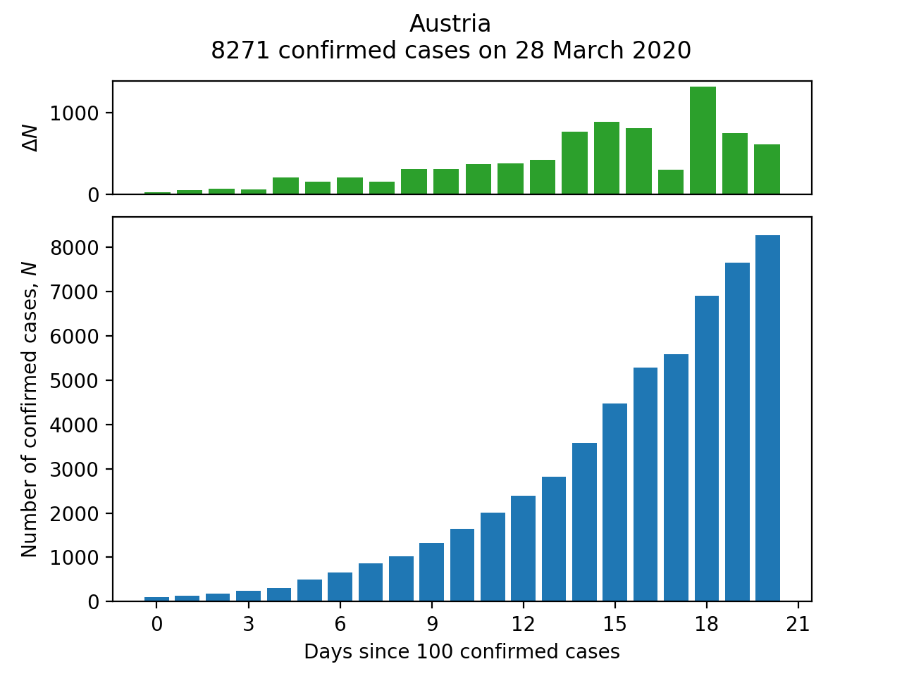
There are two functions for the different kinds of plots: a bar chart of the progression of cases or deaths for a single country (make_bar_plot) and a line chart for comparing this progression across several countries (make_comparison_plot).
For make_bar_plot, we need to extract a Series corresponding to the cases for the required country (and whilst we're about it, convert the index to a proper DatetimeIndex:
# Extract the Series corresponding to the case numbers for country.
c_df = df2.loc[country, df2.columns[3:]].astype(int)
# Convert index to a proper datetime object
c_df.index = pd.to_datetime(c_df.index)
Next, discard the rows with fewer than MIN_CASES:
c_df = c_df[c_df >= MIN_CASES]
We should probably give up at this point if there are no data to plot:
n = len(c_df)
if n == 0:
    print('Too few data to plot: minimum number of {}s is {}'
            .format(PLOT_TYPE, MIN_CASES))
    sys.exit(1)

fig = plt.Figure()
The plot is then generated with the usual Matplotlib methods:
fig = plt.Figure()

# Arrange the subplots on a grid: the top plot (case number change) is
# one quarter the height of the bar chart (total confirmed case numbers).
ax2 = plt.subplot2grid((4,1), (0,0))
ax1 = plt.subplot2grid((4,1), (1,0), rowspan=3)
ax1.bar(range(n), c_df.values)
# Force the x-axis to be in integers (whole number of days) in case
# Matplotlib chooses some non-integral number of days to label).
ax1.xaxis.set_major_locator(MaxNLocator(integer=True))

c_df_change = c_df.diff()
ax2.bar(range(n), c_df_change.values)
ax2.set_xticks([])

ax1.set_xlabel('Days since {} {}'.format(MIN_CASES, PLOT_TYPE))
ax1.set_ylabel(f'Number of {PLOT_TYPE}, $N$')
ax2.set_ylabel('$\Delta N$')

# Add a title reporting the latest number of cases available.
title = '{}\n{} {} on {}'.format(country, c_df[-1], PLOT_TYPE,
            c_df.index[-1].strftime('%d %B %Y'))
plt.suptitle(title)
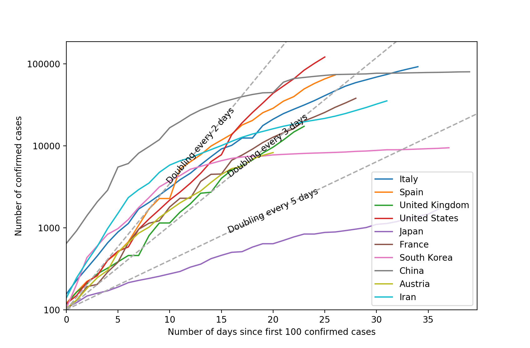
The make_comparison_plot function is slightly more complicated. This time, the c_df is a DataFrame instead of a Series because it may contain data for more than one country. If we're normalizing by dividing the case numbers by each country's population, then we match c_df against the index of the population Series in the division. Then multiply by 1,000,000 to get the figures per million people:
# Extract the Series corresponding to the case numbers for countries.
c_df = df2.loc[countries, df2.columns[3:]].astype(int)

# Discard any columns with fewer than MIN_CASES.
c_df = c_df[c_df >= MIN_CASES]

if normalize:
    # Calculate confirmed case numbers per 1,000,000 population.
    c_df  = c_df.div(populations.loc[countries], axis='index') * 1000000
At this point, the DataFrame c_df still has countries in its rows (index) and dates in the columns; countries with fewer than MIN_CASES on dates before the first country in the data to reach this threshold will have NaN values in these dates. we can take the transpose and then rearrange the DataSet into number of cases on each day after each individual country reaches MIN_CASES as follows:
# Rearrange DataFrame to give countries in columns and number of days since
# MIN_CASES in rows.
c_df = c_df.T.apply(lambda e: pd.Series(e.dropna().values))
Finally, truncate the DataFrame after MAX_DAYS worth of data (the row indexed at MAX_DAYS-1):
# Truncate the DataFrame after the maximum number of days to be considered.
c_df = c_df.truncate(after=MAX_DAYS-1)
The Matplotlib plot is complicated by the need to cater for both "normalized" and absolute data. In the case of the latter, we also plot the threshold lines corresponding to cases doubling every $\tau_2 = 2, 3\;\mathrm{and}\;5$ days. The formula for these lines is $n = n_0 2^{t/\tau_2}$, or in logarithmic form: $\log n = \log n_0 + \frac{t}{\tau_2}\log 2$ where $n_0$ is MIN_CASES. There is some further code required to label the lines and to ensure that the label is rotated and reliably in the centre of the line.
# Plot the data.
fig = plt.figure()
ax = fig.add_subplot()
for country, ser in c_df.iteritems():
    ax.plot(range(len(ser)), np.log10(ser.values), label=country)

if not normalize:
    # Set the tick marks and labels for the absolute data.
    ymin = int(np.log10(MIN_CASES))
    ymax = int(np.log10(np.nanmax(c_df))) + 1
    yticks = np.linspace(ymin, ymax, ymax-ymin+1, dtype=int)
    yticklabels = [str(10**y) for y in yticks]
    ax.set_yticks(yticks)
    ax.set_yticklabels(yticklabels)
    ax.set_ylim(ymin, ymax)
    ax.set_ylabel(f'Number of {PLOT_TYPE}')
else:
    # Set the tick marks and labels for the per 1,000,000 population data.
    ax.set_ylim(np.log10(np.nanmin(c_df)), np.log10(np.nanmax(c_df)))
    ax.set_ylabel(f'Number of {PLOT_TYPE} per 1,000,000 population')

# Label the x-axis
ax.set_xlim(0, MAX_DAYS)
ax.set_xlabel(f'Number of days since first {MIN_CASES} {PLOT_TYPE}')
ax.set_xlabel(f'Number of days since first {MIN_CASES} {PLOT_TYPE}')


def plot_threshold_lines(doubling_lifetime):
    """Add a line for the growth in numbers at a given doubling lifetime."""

    # Find the limits of the line for the current plot region.
    x = np.array([0, MAX_DAYS])
    y = np.log10(MIN_CASES) + x/doubling_lifetime * np.log10(2)
    ymin, ymax = ax.get_ylim()
    if y[1] > ymax:
        y[1] = ymax
        x[1] = doubling_lifetime/np.log10(2) * (y[1] - np.log10(MIN_CASES))
    ax.plot(x, y, ls='--', color='#aaaaaa')

    # The reason this matters is that we want to label the line at its
    # centre, rotated appropriately.
    s = f'Doubling every {doubling_lifetime} days'
    p1 = ax.transData.transform_point((x[0], y[0]))
    p2 = ax.transData.transform_point((x[1], y[1]))
    xylabel = ((x[0]+x[1])/2, (y[0]+y[1])/2)

    dy = (p2[1] - p1[1])
    dx = (p2[0] - p1[0])
    angle = np.degrees(np.arctan2(dy, dx))
    ax.annotate(s, xy=xylabel, ha='center', va='center', rotation=angle)

if not normalize:
    # If we're plotting absolute numbers, indicate the doubling time.
    plot_threshold_lines(2)
    plot_threshold_lines(3)
    plot_threshold_lines(5)

ax.legend()
Finally, to call the functions, provide some countries:
make_bar_plot('Austria')
plt.show()

countries = ['Italy', 'Spain', 'United Kingdom', 'United States',
             'Japan', 'France', 'South Korea', 'China', 'Austria', 'Iran']
make_comparison_plot(countries, normalize=False)
plt.show()