Inset plots in Matplotlib
Posted on 13 December 2016
Using AxesGrid
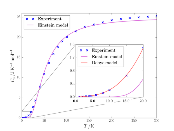
Matplotlib has included the AxesGrid toolkit since v0.99. One of the useful things this allows you to do is include "inset" figures which are often used to show greater detail of a region of the enclosing plot, as in this example (the graph is of the variation of the heat capacity of tantalum with temperature).
import numpy as np
import matplotlib.pyplot as plt
from mpl_toolkits.axes_grid.inset_locator import (inset_axes, InsetPosition,
                                                  mark_inset)

T, Cp = np.loadtxt('Ta-Cp.txt', unpack=True)
T_E, CV_E = np.loadtxt('Ta-CV_Einstein.txt', unpack=True)
T_D, CV_D = np.loadtxt('Ta-CV_Debye.txt', unpack=True)

fig, ax1 = plt.subplots()
T_E = np.arange(1,max(T)+1,1)
# The data.
ax1.plot(T, Cp, 'x', c='b', mew=2, alpha=0.8, label='Experiment')
# The Einstein fit.
ax1.plot(T_E, CV_E, c='m', lw=2, alpha=0.5, label='Einstein model')
ax1.set_xlabel(r'$T\,/\mathrm{K}$')
ax1.set_ylabel(r'$C_p\,/\mathrm{J\,K^{-1}\,mol^{-1}}$')
ax1.legend(loc=0)

# Create a set of inset Axes: these should fill the bounding box allocated to
# them.
ax2 = plt.axes([0,0,1,1])
# Manually set the position and relative size of the inset axes within ax1
ip = InsetPosition(ax1, [0.4,0.2,0.5,0.5])
ax2.set_axes_locator(ip)
# Mark the region corresponding to the inset axes on ax1 and draw lines
# in grey linking the two axes.
mark_inset(ax1, ax2, loc1=2, loc2=4, fc="none", ec='0.5')

# The data: only display for low temperature in the inset figure.
Tmax = max(T_D)
ax2.plot(T[T<=Tmax], Cp[T<=Tmax], 'x', c='b', mew=2, alpha=0.8,
         label='Experiment')
# The Einstein fit (not very good at low T).
ax2.plot(T_E[T_E<=Tmax], CV_E[T_E<=Tmax], c='m', lw=2, alpha=0.5,
         label='Einstein model')
# The Debye fit.
ax2.plot(T_D, CV_D, c='r', lw=2, alpha=0.5, label='Debye model')
ax2.legend(loc=0)

# Some ad hoc tweaks.
ax1.set_ylim(0,26)
ax2.set_yticks(np.arange(0,2,0.4))
ax2.set_xticklabels(ax2.get_xticks(), backgroundcolor='w')
ax2.tick_params(axis='x', which='major', pad=8)

plt.show()
The files used in this code are: Ta-Cp.txt, Ta-CV_Einstein.txt, Ta-CV_Debye.txt.
The key lines of this program are those creating a second set of Axes, ax2 and attaching them in an inset position to the figure. The list of values [0.4,0.2,0.5,0.5] set the lower left position of the Axes (x, y coordinates) and its width and height respectively in fractional units of the dimensions of the enclosing Axes, ax1. That is, for example, the height of the inset Axes are half of the height of the outer Axes.
ax2 = plt.axes([0,0,1,1])
ip = InsetPosition(ax1, [0.4,0.2,0.5,0.5])
ax2.set_axes_locator(ip)
Finally, mark_inset is used to draw a box around the region of ax1 corresponding to the data plotted in the inset, ax2. Lines are drawn between corresponding corners of the Axes indicated by loc1 and loc2: here, 2 and 4 are the "top left" and "bottom right" corners.
mark_inset(ax1, ax2, loc1=2, loc2=4, fc="none", ec='0.5')
Note that it is necessary to (re)plot the data you want to visualize in the inset axes, ax2, but mark_inset can be called before plotting the data: the box and marker lines are added when the canvas is rendered.
Without using AxesGrid
To do all this without using these convenience routines, there's a lot more work to do:
import numpy as np
import matplotlib.pyplot as plt
from matplotlib import lines
from matplotlib.patches import Rectangle
from matplotlib.transforms import Bbox

T, Cp = np.loadtxt('Ta-Cp.txt', unpack=True)
T_E, CV_E = np.loadtxt('Ta-CV_Einstein.txt', unpack=True)
T_D, CV_D = np.loadtxt('Ta-CV_Debye.txt', unpack=True)

fig, ax1 = plt.subplots()
T_E = np.arange(1,max(T)+1,1)
# The data.
ax1.plot(T, Cp, 'x', c='b', mew=2, alpha=0.8, label='Experiment')
# The Einstein fit.
ax1.plot(T_E, CV_E, c='m', lw=2, alpha=0.5, label='Einstein model')
ax1.set_xlabel(r'$T\,/\mathrm{K}$')
ax1.set_ylabel(r'$C_p\,/\mathrm{J\,K^{-1}\,mol^{-1}}$')
ax1.legend(loc=0)

# Inset figure of low-temperature fit, located by data coordinates in ax1.
bb_data_ax2 = Bbox.from_bounds(140, 5, 130, 15)
disp_coords = ax1.transData.transform(bb_data_ax2)
fig_coords_ax2 = fig.transFigure.inverted().transform(disp_coords)
bb_ax2 = Bbox(fig_coords_ax2)
ax2 = fig.add_axes(bb_ax2)

# The data: only display for low temperature in the inset figure.
Tmax = max(T_D)
ax2.plot(T[T<=Tmax], Cp[T<=Tmax], 'x', c='b', mew=2, alpha=0.8,
         label='Experiment')
# The Einstein fit (not very good at low T).
ax2.plot(T_E[T_E<=Tmax], CV_E[T_E<=Tmax], c='m', lw=2, alpha=0.5,
         label='Einstein model')
# The Debye fit.
ax2.plot(T_D, CV_D, c='r', lw=2, alpha=0.5, label='Debye model')
ax2.legend(loc=0)

# Draw a rectangle around the region of the plot on ax1 corresponding to ax2.
bb_data_rect = Bbox.from_bounds(0,0, Tmax, CV_D[-1])
disp_coords = ax1.transData.transform(bb_data_rect)
fig_coords_rect = fig.transFigure.inverted().transform(disp_coords)
xa0, ya0, xa1, ya1 = fig_coords_rect.flatten()
ax1.add_patch(Rectangle((xa0, ya0), xa1-xa0, ya1-ya0,
                        transform=fig.transFigure, facecolor='none'))
# Now draw connecting lines between the rectangle and the inset axes, ax2
xb0, yb0, xb1, yb1 = fig_coords_ax2.flatten()
line = lines.Line2D([xa1, xb1], [ya0, yb0], transform=fig.transFigure,
                    color='0.5')
ax1.add_line(line)
line = lines.Line2D([xa0, xb0], [ya1, yb1], transform=fig.transFigure,
                    color='0.5')
ax1.add_line(line)

# Some ad hoc tweaks.
ax1.set_ylim(0,26)
ax2.set_yticks(np.arange(0,2,0.4))
ax2.set_xticklabels(ax2.get_xticks(), backgroundcolor='w')
ax2.tick_params(axis='x', which='major', pad=8)

plt.show()
We've had to work out where to place the inset Axes, transforming between units explicitly:
bb_data_ax2 = Bbox.from_bounds(140, 5, 130, 15)
disp_coords = ax1.transData.transform(bb_data_ax2)
fig_coords_ax2 = fig.transFigure.inverted().transform(disp_coords)
bb_ax2 = Bbox(fig_coords_ax2)
ax2 = fig.add_axes(bb_ax2)
The draw a rectangle on the enclosing Axes (again, transforming the units):
bb_data_rect = Bbox.from_bounds(0,0, Tmax, CV_D[-1])
disp_coords = ax1.transData.transform(bb_data_rect)
fig_coords_rect = fig.transFigure.inverted().transform(disp_coords)
xa0, ya0, xa1, ya1 = fig_coords_rect.flatten()
ax1.add_patch(Rectangle((xa0, ya0), xa1-xa0, ya1-ya0,
                        transform=fig.transFigure, facecolor='none'))
Finally, the lines joining this region to the inset axes have to be added explicitly:
xb0, yb0, xb1, yb1 = fig_coords_ax2.flatten()
line = lines.Line2D([xa1, xb1], [ya0, yb0], transform=fig.transFigure,
                    color='0.5')
ax1.add_line(line)
line = lines.Line2D([xa0, xb0], [ya1, yb1], transform=fig.transFigure,
                    color='0.5')
ax1.add_line(line)