
The Python script below generates the following visualization of COVID deaths per 100,000 people for two classes of European country: those with less than 75% of the population vaccinated and those with at least this percentage vaccinated. The ongoing (as of January 2022) third wave of infections is causing fewer deaths in the countries with a higher vaccination rate.
Although the case for vaccination is compelling, I suppose one should be careful with this sort of statistic, however, because it does not account for other factors that correlate with low vaccination uptake in a population (e.g. those countries with relatively lower rates of vaccination tend to be poorer).
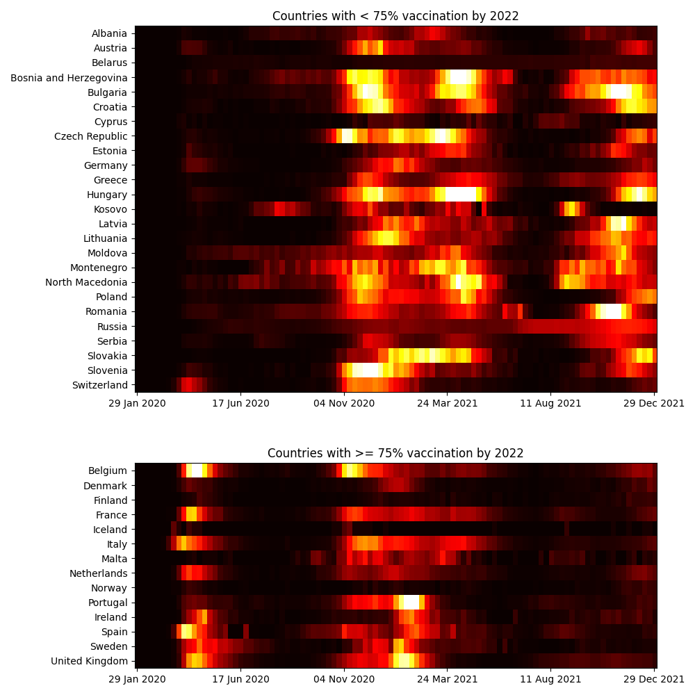
Some additional files are needed: covid-19-deaths-to-20220102.csv, vaccinations.csv (data from Wikipedia), country_populations.csv.
import sys
import pandas as pd
import numpy as np
import matplotlib.pyplot as plt
from matplotlib.ticker import MaxNLocator
from datetime import datetime

from country_aliases import country_aliases

DPI = 100

# If you have saved a local copy of the CSV file as LOCAL_CSV_FILE,
# set READ_FROM_URL to True.
READ_FROM_URL = True

data_loc = ('https://raw.githubusercontent.com/CSSEGISandData/COVID-19/'
            'master/csse_covid_19_data/csse_covid_19_time_series/'
            'time_series_covid19_deaths_global.csv')
LOCAL_CSV_FILE = 'covid-19-deaths-to-20220102.csv'

# Read in COVID deaths data to a DataFrame.
df = pd.read_csv(data_loc)
df.rename(columns={'Country/Region': 'Country'}, inplace=True)

# Read in the populations file as a Series (squeeze=True) indexed by country.
populations = pd.read_csv('country_populations.csv', index_col='Country',
                          squeeze=True)
# Not really needed, but edit to match the deaths data to the populations data.
populations.rename(index={'Myanmar': 'Burma'}, inplace=True)
populations.drop('Turkmenistan', inplace=True)
populations.drop('North Korea', inplace=True)
populations.drop('Hong Kong (China)', inplace=True)

# Read in the vaccination percentages for each country.
vaccinations = pd.read_csv('vaccinations.csv', index_col=0)
vaccinations.columns = vaccinations.columns.str.strip()

# Group by country and sum over the different states/regions of each country.
grouped = df.groupby('Country')
df2 = grouped.sum()
df2.rename(index=country_aliases, inplace=True)
# Recast the death numbers as deaths per 100,000 population.
df2 = df2.div(populations.loc[vaccinations.index], axis='index') * 100_000

# Extract the numerical data, do some cleaning.
arr = df2.diff(axis=1).iloc(axis=1)[3:]
arr.fillna(0, inplace=True)
arr.values[arr.values<0]=0

# Bin together the daily deaths to death totals every n days.
m = arr.shape[1]
n = 7
arr2 = arr.groupby([[i//n for i in range(0, m)]], axis=1).sum()
# We only want complete n-day runs in our data: lop off the last data point if
# it spans less than n days:
if arr2.shape[1] % n:
    arr2 = arr2.iloc[:, :-1]
# Reattach the column headings, casting them to proper datetime objects.
arr2.columns = pd.to_datetime(df2.columns[2+n::n])

def plot_heatmap(ax, countries):
    """Plot a heatmap of COVID deaths for countries on Axes object ax."""

    # Extract the data for the required countries.
    arr3 = arr2.loc[countries]
    # Clip the max of the colormap to get rid of outliers / data corrections.
    vmax = 2 * n

    # The heatmap: aspect='auto' makes it fill the Axes.
    ax.imshow(arr3, aspect='auto', cmap='hot', vmax=vmax)
    # Add country names as y-axis ticklabels.
    ax.set_yticks(range(len(countries)))
    ax.set_yticklabels(list(countries))
    # Add dates every 20 weeks as x-axis ticklabels.
    xticks = range(0, arr3.shape[1], 20)
    ax.set_xticks(xticks)
    ax.set_xticklabels([datetime.strftime(s, '%d %b %Y')
                        for s in arr3.columns[xticks]])


# Number of time points on x-axis.
nx = arr.shape[1]
# Low vaccination (< 75%) countries.
lowvacc_countries = vaccinations[vaccinations['%'] < 75].index
ny0 = len(lowvacc_countries)
# High vaccination (>= 75%) countries.
highvacc_countries = vaccinations[vaccinations['%'] >= 75].index
ny1 = len(highvacc_countries)

# Create a new Matplotlib Figure with two subplots; set the subplot heights
# in proportion to the number of countries in each class.
fig, ax = plt.subplots(nrows=2, ncols=1, dpi=DPI,
        gridspec_kw={'height_ratios': [ny0, ny1]}, figsize=(10, 10))

# Plot and title the heatmaps.
plot_heatmap(ax[0], lowvacc_countries)
ax[0].set_title('Countries with < 75% vaccination by 2022')
plot_heatmap(ax[1], highvacc_countries)
ax[1].set_title('Countries with >= 75% vaccination by 2022')

# Make sure the y-axis labels fit, and add some extra vertical spacing between
# the subplots.
plt.tight_layout()
plt.subplots_adjust(hspace=0.25)

plt.savefig('covid-heatmap.png')
plt.show()