E31.1: The Melting and Boiling Points of the Elements
The file element-data.csv, contains comma-separated, tabular data concerning the properties of the elements. Missing data are indicated with a hyphen character, '-'.
import pandas as pd
df = pd.read_csv('element-data.csv', index_col=0, na_values='-')
# how the first 5 rows of the DataFrame.
df.head()
             name  Z  ... melting point /K  boiling point /K
Symbol                ...
H        Hydrogen  1  ...            13.99            20.271
He         Helium  2  ...             1.80             4.222
Li        Lithium  3  ...           453.70          1603.000
Be      Beryllium  4  ...          1560.00          2742.000
B           Boron  5  ...          2349.00          4200.000

[5 rows x 8 columns]
The abundance is that of the elements in the Earth's crust as a fractional value; we might prefer to express it in parts per million (ppm) for this example:
df['abundance'] *= 1.e6
# Also rename the column to include the "units".
df.rename(columns={'abundance': 'abundance /ppm'}, inplace=True)
The standard NumPy-like operations can also be carried out on a pandas DataFrame. For example, to determine which elements are liquids at room temperature (and, implicitly, standard pressure):
Troom = 298
# Liquids are those with a melting point below room temperature but
# a boiling point above room temperature.
df[(df['melting point /K'] < Troom) & (df['boiling point /K'] > Troom)]
            name   Z  ... melting point /K  boiling point /K
Symbol                ...
Br       Bromine  35  ...            265.8            332.00
Hg       Mercury  80  ...            234.3            629.88
Fr      Francium  87  ...            281.0            890.00

[3 rows x 8 columns]
We can also determine the densest element and the least-dense solid element in a similar way:
symbol = df['density /kg.m-3'].idxmax()
rho_max = df.loc[symbol]['density /kg.m-3']
print(f'Element with the greatest density: {symbol} ({rho_max} kg.m-3)')

# First extract only the solid elements from our DataFrame.
solids_df = df[df['melting point /K'] > Troom]
symbol = solids_df['density /kg.m-3'].idxmin()
rho_min = df.loc[symbol]['density /kg.m-3']
print(f'Solid element with the lowest density: {symbol} ({rho_min} kg.m-3)')
Element with the greatest density: Os (22590.0 kg.m-3)
Solid element with the lowest density: Li (534.0 kg.m-3)
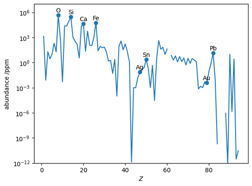
The abundance can be plotted as a line chart; in this case it is most useful to use a logarithmic scale for the \(y\)-axis.
import numpy as np
import matplotlib.pyplot as plt

fig, ax = plt.subplots()
# Since we're going to take the log of the abundance, replace the zeros with NaN.
ax.plot(df['Z'], df['abundance /ppm'].replace(0, np.nan))
ax.set_yscale('log')
ax.set_ylim(1e-12, 1e7)

# Add labels and markers for some significant elements.
symbols = ['O', 'Si', 'Ca', 'Fe', 'Ag', 'Sn', 'Au', 'Pb']
for symbol in symbols:
    x, y = df.loc[symbol, ['Z', 'abundance /ppm']]
    ax.text(x, y, symbol, ha='center', va='bottom')
ax.scatter(*df.loc[symbols, ['Z', 'abundance /ppm']].T.values)
ax.set_xlabel(r'$Z$')
ax.set_ylabel(r'abundance /ppm')
