Posted by: christian on 3 Mar 2017
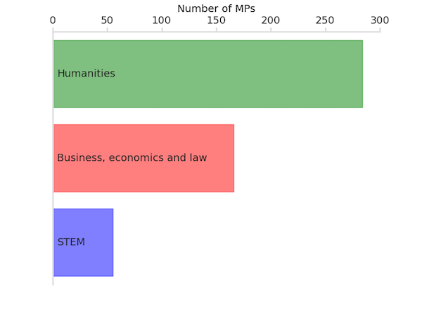
Not many:
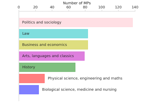
Broken down into eight separate categories:
The code used to generate the above plot is below. The data required are degree_classifications.tar.gz and mp-resolved-degrees.tsv.
from collections import Counter
import matplotlib.pyplot as plt

LIGHT_GREY = '#dddddd'
DARK_GREY = '#222222'

def get_subject_counts(broad_classifications):
    """
    Count the number of subjects in each of broad_classifications, a dictionary
    of tuples containing the classification names with the broad classification
    area as the key. For example, {'STEM': ('physics', 'chemistry', ...), ...},
    The file 'degree_classifications/<classification>.class.txt' contains a
    list of subjects belonging to that classification.

    """

    # Invert the dictionary to classification: broad classification
    broad_classifications = {s: bc for bc, t in broad_classifications.items()
                                            for s in t}

    def read_classifications():
        """Read in the classification files listing all subjects."""

        classifications = broad_classifications.keys()
        subjects = dict((s.strip(), broad_classifications[c])
                for c in classifications
                for s in open('degree_classifications/{}.class.txt'.format(c)))
        return subjects

    subjects = read_classifications()

    # Count the subjects in each broad classification.
    subject_counts = Counter([subjects[line.split('\t')[1].strip()]
                            for line in open('mp-resolved-degrees.tsv')])
    return subject_counts

def plot_bar_chart(subject_counts, filename):
    """Plot a bar chart of MPs' degree subjects by broad classification."""

    colours=['b','r','g','m','y','c','pink','brown']
    ncolours = len(colours)
    n = len(subject_counts)

    fig, ax = plt.subplots()
    # Get the broad classification names and sort in order of increasing number
    broad_classifications = list(subject_counts.keys())
    broad_classifications.sort(key=lambda e: subject_counts[e])
    counts = [subject_counts[bc] for bc in broad_classifications]

    # Draw, then colour the bars, and add the broad classification name.
    bars = ax.barh(range(n), counts, align='center', edgecolor='none',
                   alpha=0.5)
    for i, bar in enumerate(bars):
        bc = broad_classifications[i]
        bar.set_color(colours[i % ncolours])
        xpos = 0
        if bar._width < len(bc):
            # label likely won't fit inside the bar: place it outside.
            xpos = bar._width
        ax.annotate(bc, (xpos + 4, i), va='center', color=DARK_GREY)

    # Ticks, labels, styling, etc.
    ax.set_yticks([])
    ax.xaxis.set_ticks_position('top')
    ax.set_xlabel('Number of MPs')
    ax.xaxis.set_label_position('top')
    ax.tick_params(axis='x', size=6, colors=LIGHT_GREY, width=2,
                   direction='out')
    [label.set_color(DARK_GREY) for label in ax.get_xticklabels()]

    for spine in ('bottom', 'right'):
        ax.spines[spine].set_visible(False)
    for spine in ('left', 'top'):
        ax.spines[spine].set_linewidth(2)
        ax.spines[spine].set_color(LIGHT_GREY)
    # Don't let the gridlines go over the plotted bars
    ax.set_axisbelow(True)

    plt.savefig(filename)

# First plot: eight different broad classifications.
broad_classifications = {
'Physical science, engineering and maths': ('engineering',
        'mathematics_and_computer_science', 'physical_science'),
'Biological science, medicine and nursing': ('biological_science', 'medicine'),
'Business and economics': ('business_and_finance', 'economics','land_economy'),
'Politics and sociology': ('PPE', 'politics','sociology',),
'Law': ('law',),
'History': ('history',),
'Arts, languages and classics': ('arts', 'classics', 'languages',
         'literature',
         'miscellaneous_humanities', 'teaching'),
}

subject_counts = get_subject_counts(broad_classifications)
plot_bar_chart(subject_counts, 'plot8.png')

# Second plot: three different broad classifications.
broad_classifications = {
'STEM': ('engineering', 'mathematics_and_computer_science', 'physical_science',
         'biological_science', 'medicine'),
'Humanities': ('PPE', 'arts', 'classics', 'history', 'languages', 'literature',
         'miscellaneous_humanities', 'politics', 'sociology', 'teaching'),
'Business, economics and law': ('business_and_finance', 'economics',
         'land_economy', 'law')
}

subject_counts = get_subject_counts(broad_classifications)
plot_bar_chart(subject_counts, 'plot3.png')
Comments
Comments are pre-moderated. Please be patient and your comment will appear soon.
There are currently no comments
New Comment