Learning Scientific Programming with Python (2nd edition)
E7.16: A depiction of the electromagnetic spectrum
The program below annotates a simple wave plot to indicate the different regions of the electromagnetic spectrum, using text, axvline, axhline and axvspan.
import numpy as np
import matplotlib.pyplot as plt

# wavelength range, nm
lmin, lmax = 250, 1000
x = np.linspace(lmin, lmax, 1000)
# A wave with a smoothly increasing wavelength
wv = (np.sin(10 * np.pi * x / (lmax + lmin - x)))[::-1]

fig, ax = plt.subplots()
ax.set_facecolor("k")
ax.plot(x, wv, c="w", lw=2)
ax.set_xlim(250, 1000)
ax.set_ylim(-2, 2)

# Label and delimit the different regions of the electromagnetic spectrum
ax.text(310, 1.5, "UV", color="w", fontdict={"fontsize": 14})
ax.text(530, 1.5, "Visible", color="k", fontdict={"fontsize": 14})
ax.annotate(
    "",
    (400, 1.3),
    (750, 1.3),
    arrowprops={"arrowstyle": "<|-|>", "color": "w", "lw": 2},
)
ax.text(860, 1.5, "IR", color="w", fontdict={"fontsize": 14})
ax.axvline(400, -2, 2, c="w", ls="--")
ax.axvline(750, -2, 2, c="w", ls="--")
# Horizontal "axis" across the centre of the wave
ax.axhline(c="w")
# Ditch the y-axis ticks and labels; label the x-axis
ax.yaxis.set_visible(False)
ax.set_xlabel(r"$\lambda\;/\mathrm{nm}$")

# Finally, add some colourful rectangles representing a rainbow in the
# visible region of the spectrum.
# Dictionary mapping of wavelength regions (nm) to approximate RGB values
rainbow_rgb = {
    (400, 440): "#8b00ff",
    (440, 460): "#4b0082",
    (460, 500): "#0000ff",
    (500, 570): "#00ff00",
    (570, 590): "#ffff00",
    (590, 620): "#ff7f00",
    (620, 750): "#ff0000",
}
for wv_range, rgb in rainbow_rgb.items():
    ax.axvspan(*wv_range, color=rgb, ec="none", alpha=1)
plt.show()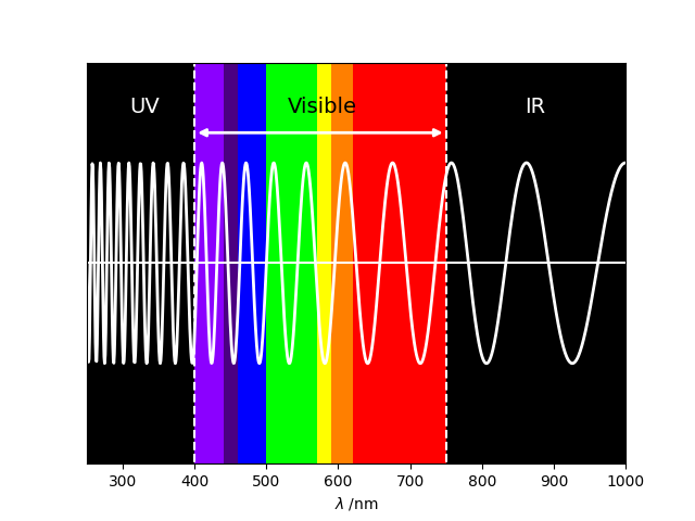
The electromagnetic spectrum in the region 250 – 1000 nm.