Posted by: christian on 27 Apr 2016
It's certainly been colder than usual in Britain over the last couple of weeks. How unusual is it to have these temperatures at the end of April?
The UK Met Office provides free downloads of data from its weather stations on a monthly average basis (without registration) and on a daily basis within various geographical "grids" (registration required), but for this post I used the freely-available weather data from the Cambridge Univeristy Digital Technology Group. The daily files (since 1995) can be downloaded as a gzipped tar archive from this page.
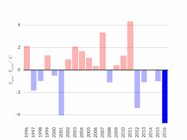
The following script produces the above figure comparing the average maximum temperature in the last two weeks of April for each year since 1996 with the average across all years. In Cambridge, at least, this year seems to have experienced the coldest end to April for at least 20 years.
import os
import numpy as np
import matplotlib.pyplot as plt

import matplotlib
matplotlib.rcParams['font.family'] = 'sans-serif'
matplotlib.rcParams['font.sans-serif'] = 'Lato'
csfont = {'fontname':'Lato Regular'}

# Constraints on the data analysis; location of the data files
YEAR_MIN, YEAR_MAX = 1996, 2016
DAY_MIN, DAY_MAX = 17, 30
DATA_DIR = os.path.join(os.getenv('HOME'), 'Downloads/daily-text')

LIGHT_GREY = '#dddddd'

nyears = YEAR_MAX-YEAR_MIN + 1
ndays = DAY_MAX - DAY_MIN + 1

# Find the average maximum temperature for the last ndays of April
av_maxT = np.zeros(nyears)
for i in range(nyears):
    year = YEAR_MIN + i
    nmissing = 0
    for day in range(DAY_MIN, DAY_MAX+1):
        filename = os.path.join(DATA_DIR,
                        '{year:4d}_04_{day:2d}'.format(year=year, day=day))
        try:
            temperatures = np.loadtxt(filename, usecols=(1,), skiprows=8)
        except FileNotFoundError:
            nmissing += 1
        av_maxT[i] += max(temperatures)
    av_maxT[i] /= (ndays - nmissing)
    print(av_maxT[i])

# Find the average maximum temperature for the last ndays in April across all
# years.
av_T = np.mean(av_maxT)

# The deviations from the average for each year.
dT = av_maxT - av_T

# Plot our chart
fig, ax = plt.subplots(facecolor='w')
years = YEAR_MIN + np.linspace(0,nyears-1,nyears)
bars = ax.bar(years, dT, align='center', alpha=0.3, ec='none')
# Colour all years with temperatures above the mean in red
for bar in bars:
    if bar.get_y() >= 0:
        bar.set_color('r')
# Highlight the last year by setting its opacity to 1
bar.set_alpha(1)

# Tidy up the plot with some nice styles.
ax.set_xticks(years)
ax.set_xlim(YEAR_MIN-0.5, YEAR_MAX+0.5)
ax.set_ylim(np.floor(min(dT)), np.ceil(max(dT)))
ax.set_ylabel(r'$T_\mathrm{max} - \bar{T}_\mathrm{max} / ^\circ\mathrm{C}$')
for tick in ax.get_xticklabels():
    tick.set_rotation(90)
for spine_pos in ('top', 'right', 'bottom', 'left'):
    ax.spines[spine_pos].set_visible(False)
ax.xaxis.set_ticks_position('none')
ax.yaxis.set_ticks_position('none')
ax.yaxis.set_tick_params(pad=10)
ax.axhline(lw=2, color='k')
ax.yaxis.grid(which='major', c=LIGHT_GREY, lw=2, ls='-')
ax.set_axisbelow(True)

plt.savefig('cold_april.png')
plt.show()
Comments
Comments are pre-moderated. Please be patient and your comment will appear soon.
There are currently no comments
New Comment